CLIENT
U Mobile
PROJECT
Styling an unbeatable telco brand
DISCIPLINE
Brand Positioning, Visual Identity System, Brand Messaging, Brand Guidelines
The much anticipated launch of 5G services in Malaysia in 2022 created a period of intense planning and preparation among the country’s leading telcos. Data plans were tweaked and propositions polished as the new 5G infrastructure created a level playing field from which players had the chance to reposition themselves in the marketplace and grab share.
For U Mobile, which had for many years found success in being an irreverent and cost-conscious challenger, the advent of 5G presented an opportunity to extend the appeal and credibility of its brand to new audience segments while retaining its appeal to its existing users.
U Mobile had always prided itself on being unconventional. It’s curvilinear logo and offbeat humour spoke of a telco that did things differently, and this was reinforced by its creative, category-busting approach to prepaid data plans and communication. The challenge was to retain the essence of the U Mobile brand, while also being seen as a leader in the 5G space for postpaid customers, connected households and businesses.
U Mobile had always prided itself on its innovative and competitive plans, but 5G gave the opportunity to carry this hunger to deliver better to new segments and business lines. The first step was to find a powerful articulation of U Mobile’s promise for its 5G future – Unbeatable!

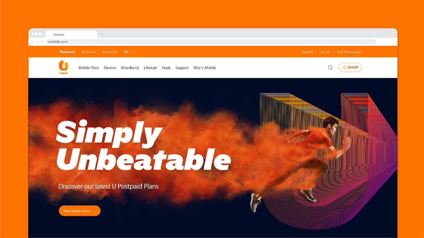
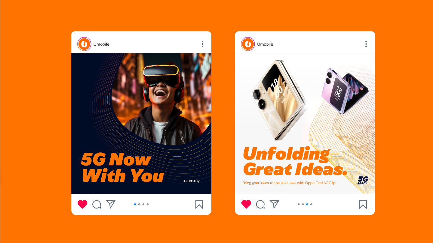
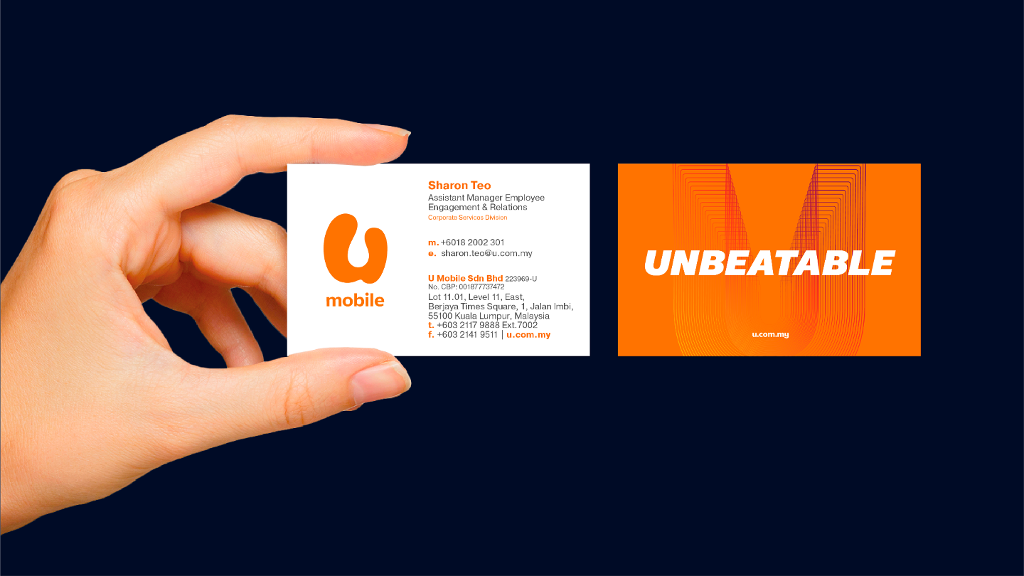
The distinctive, friendly U Mobile logo would not be changed, so the task was to create a visual system that gave the brand more range and sophistication and connected with the ‘Unbeatable’ proposition.
We developed a wireframe version of a ‘U’ that could swivel and orient in any direction to support messaging and imagery, or become the hero in its own right.

When applied in combination with a carefully developed set of colour treatments, iconography and callouts, the ‘U’ provided the basis for a refreshed visual identity system that gave the brand a more contemporary, technical feel and supported clear segmentation between prepaid, postpaid and business segments.
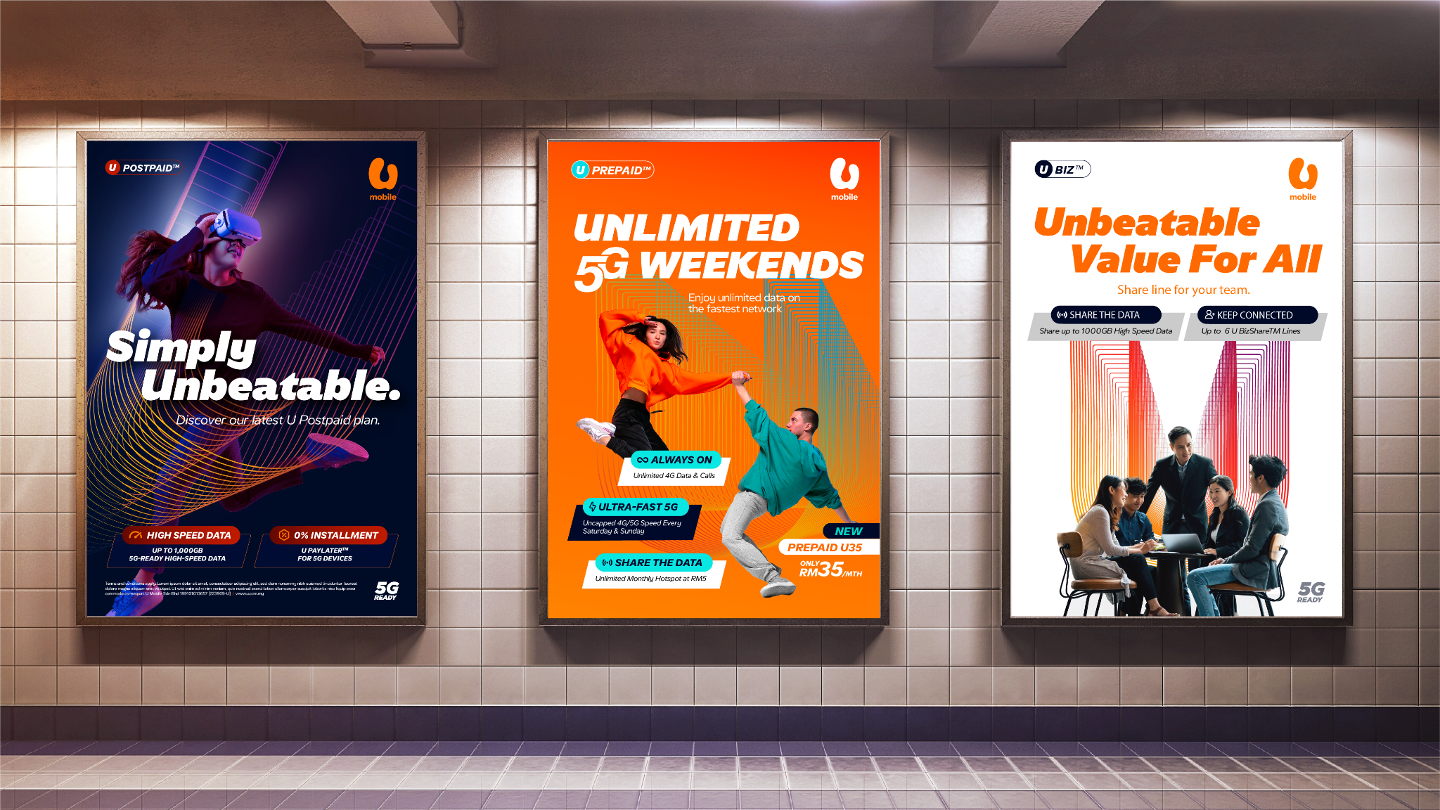
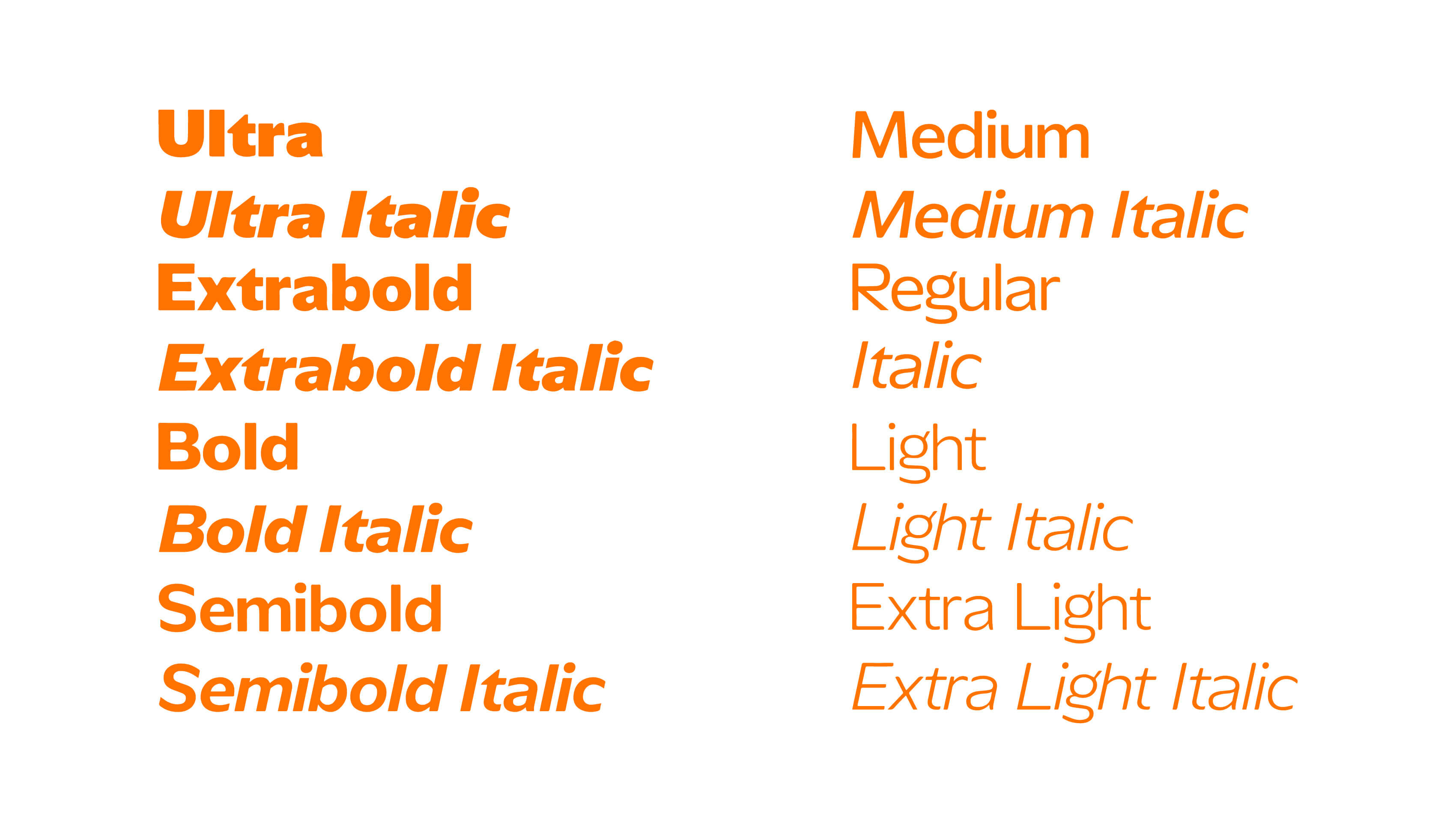
The unique character of the brand embodied in the logo also found expression in a custom font that combined a bold authority with small unexpected details that spoke to the innate playfulness and unconformity of that remained at the heart of U Mobile.