CLIENT

POS Malaysia

PROJECT

Transforming Malaysia’s postal services

DISCIPLINE

Insight, Research & Analytics, Brand Purpose & Visioning, Brand Positioning, Customer Value Proposition, Corporate Identity, UX/UI

CHALLENGE

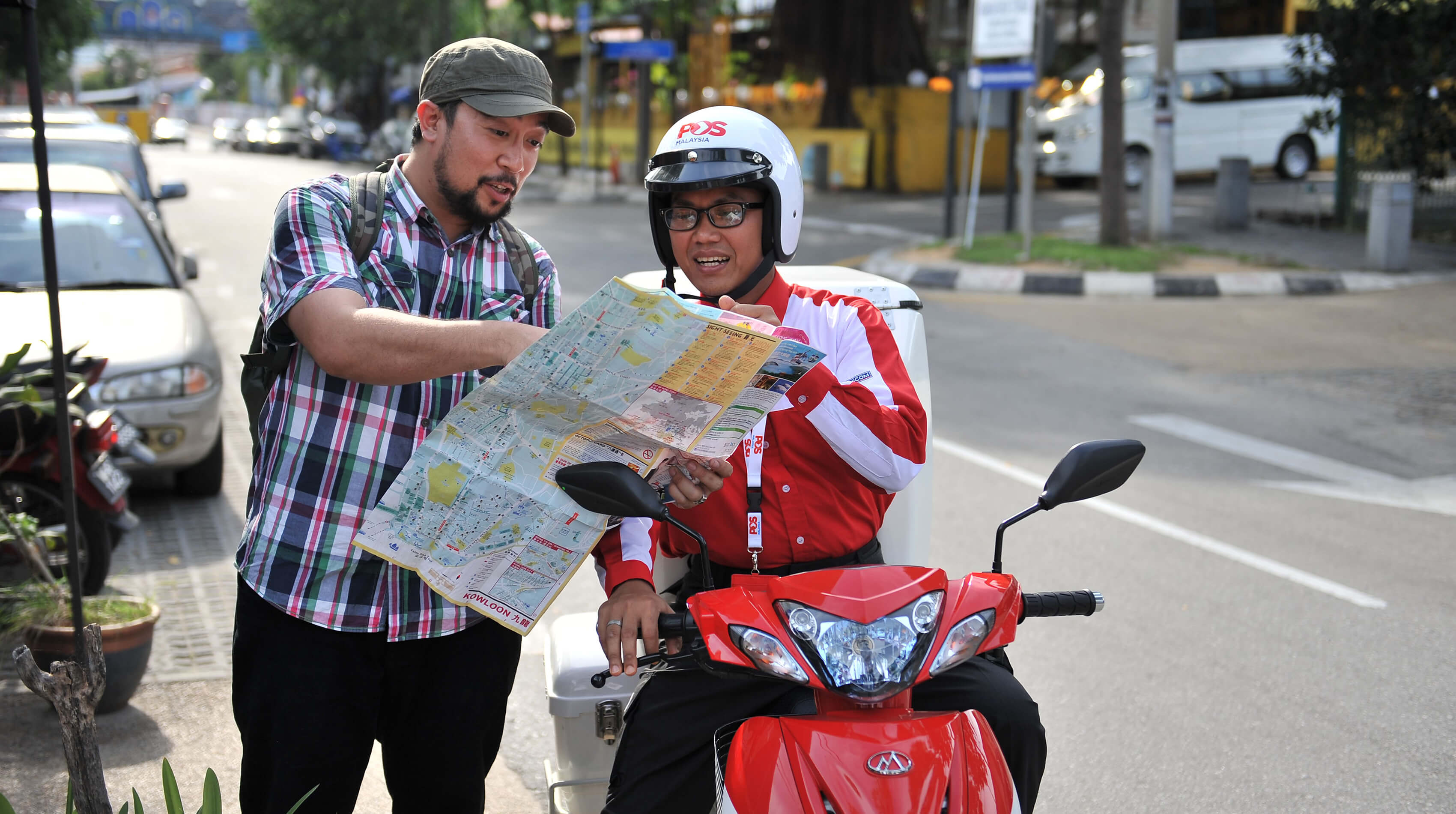
POS Malaysia has been an integral part of every Malaysians’ life since postal services started in the 1800’s. Today POS Malaysia has 17,000 employees, 700 retail outlets, delivers mail to 6 million households, uses over 21,000 vehicles.

The changing postal landscape: operators around the world face stringent challenges led by the serial decline of traditional postal services and the rise of digital communications and the demands of e-commerce fulfillment.

Read more

Postal service 2.0: a new business model demands a new brand vision for the future, a mission to get there and a new set of values to govern behaviour. All must be adopted internally and embraced externally and applied consistently across all touchpoints.

SOLUTION

To define the future of POS we needed to assess the health of the brand, to check its pulse. We began by interviewing a core group of internal stakeholders to understand the brand challenges across divisions and all levels of staff. This study revealed a yawning gap between the experience of POS today and the desired experience of POS tomorrow.

SOLUTION

POS needed a higher purpose, with the mandate to apply this new purpose to the individual entities and so change stakeholders’ impression of the brand.

SOLUTION

Vision: Connecting Malaysia and beyond for today and tomorrow. To build and deliver the network of choice.

Values: that drive our behaviours: empathy, innovation, integrity, decorum, and accountability.

Read more

Brand Promise: For all Malaysians we are the trusted network that empowers individuals and enables enterprise to advance our community, commerce, and country.

The brand promise was translated into our personality, a reflection of those characteristics our customers relate to, understand, and see in our business: Drive, Pride, Passion, and Reliability.

Bringing it all together, the entire strategy was delivered to align every aspect of the organisation, business, and brand.

SOLUTION

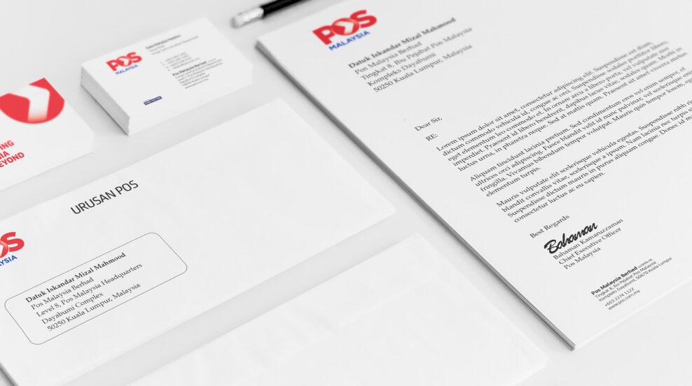
But to be truly impactful, the brand strategy had to translate into a brand identity to reflect the new direction of the POS Malaysia brand and resonate in the hearts and minds of all stakeholders. POS Malaysia’s legacy identities were characterized by reference to age-old mailing traditions – from wax seals to the carrier pigeon. To make a clean break we created a new mark to signal the shift to digital services and to reinforce the promise that POS was on the move.

SOLUTION

The POS sub-brands needed an approach that would help to simplify and amplify the brand architecture. So we employed a monolithic brand strategy, driving a singular brand expression through every part of the growing family. The portfolio of POS brands were re-organised into a three tier structure based on Channels, Sub-brands and Products.

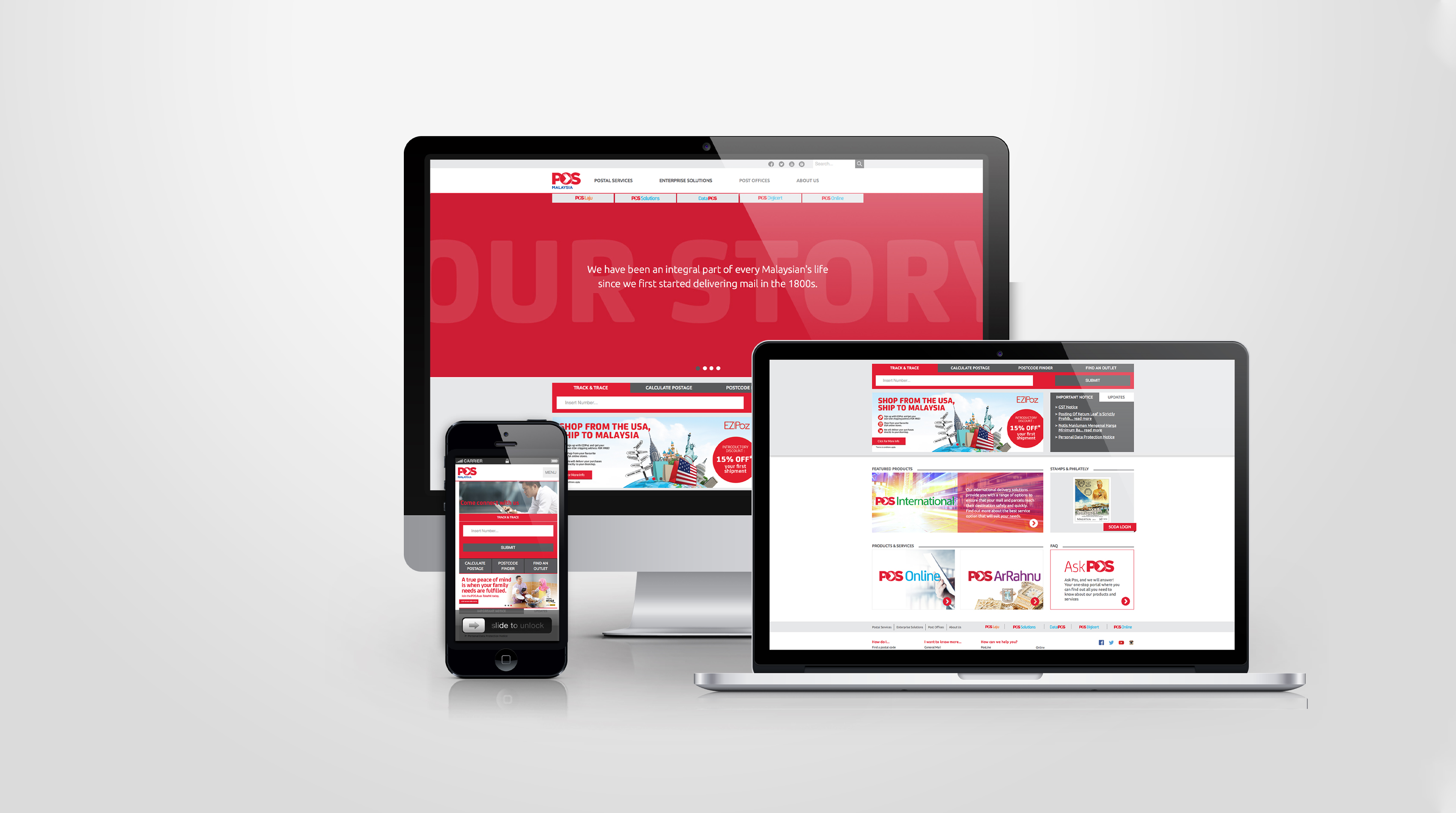
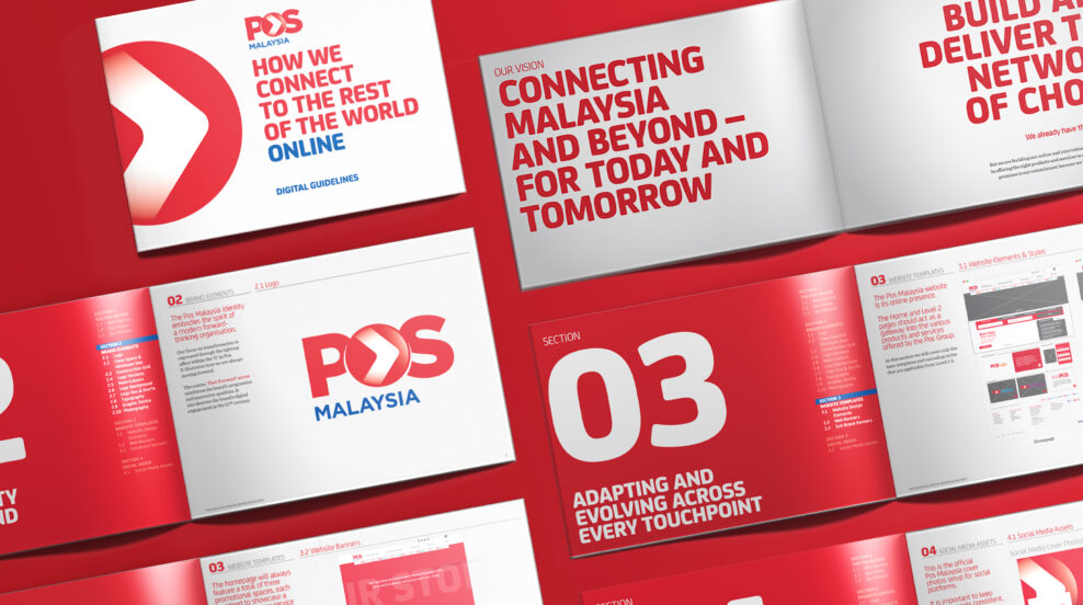
We developed the CX, UX, and UI for a new integrated POS mobile app and a simplified, responsive POS corporate and sub-brand website. We also managed all of POS Malaysia’s social media activity post-launch. To drive social media activity, we helped POS Malaysia select, recruit and train a social media community manager to deliver the consistent brand experience across all social channels. To manage the new brand assets efficiently, and keep them up to date, we developed an online brand portal for POS. We developed comprehensive brand, retail and digital guidelines to govern the application of the brand identity across all touchpoints.

RESULT

We ensured that every member of POS Malaysia understood what the brand means, what it stands for and how they contribute to its value. We then consistently rolled out the identity nationwide from cities to villages to people’s doorsteps.

Read more

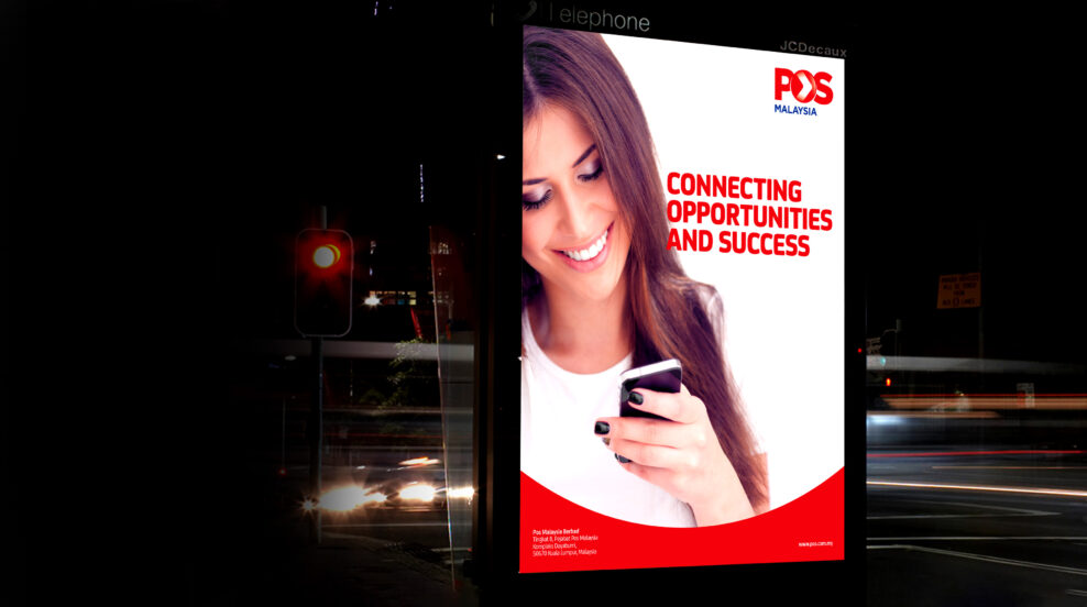
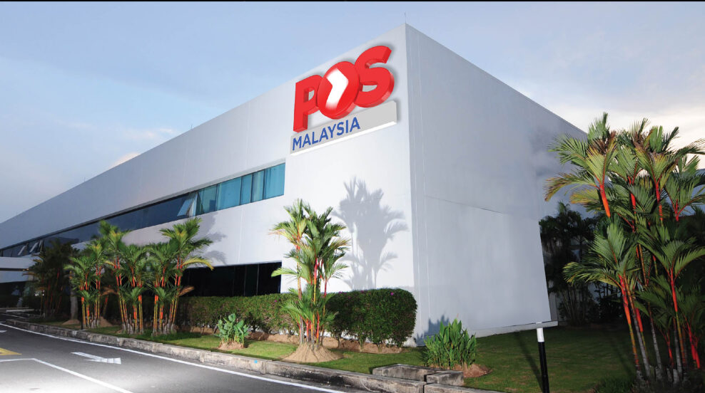
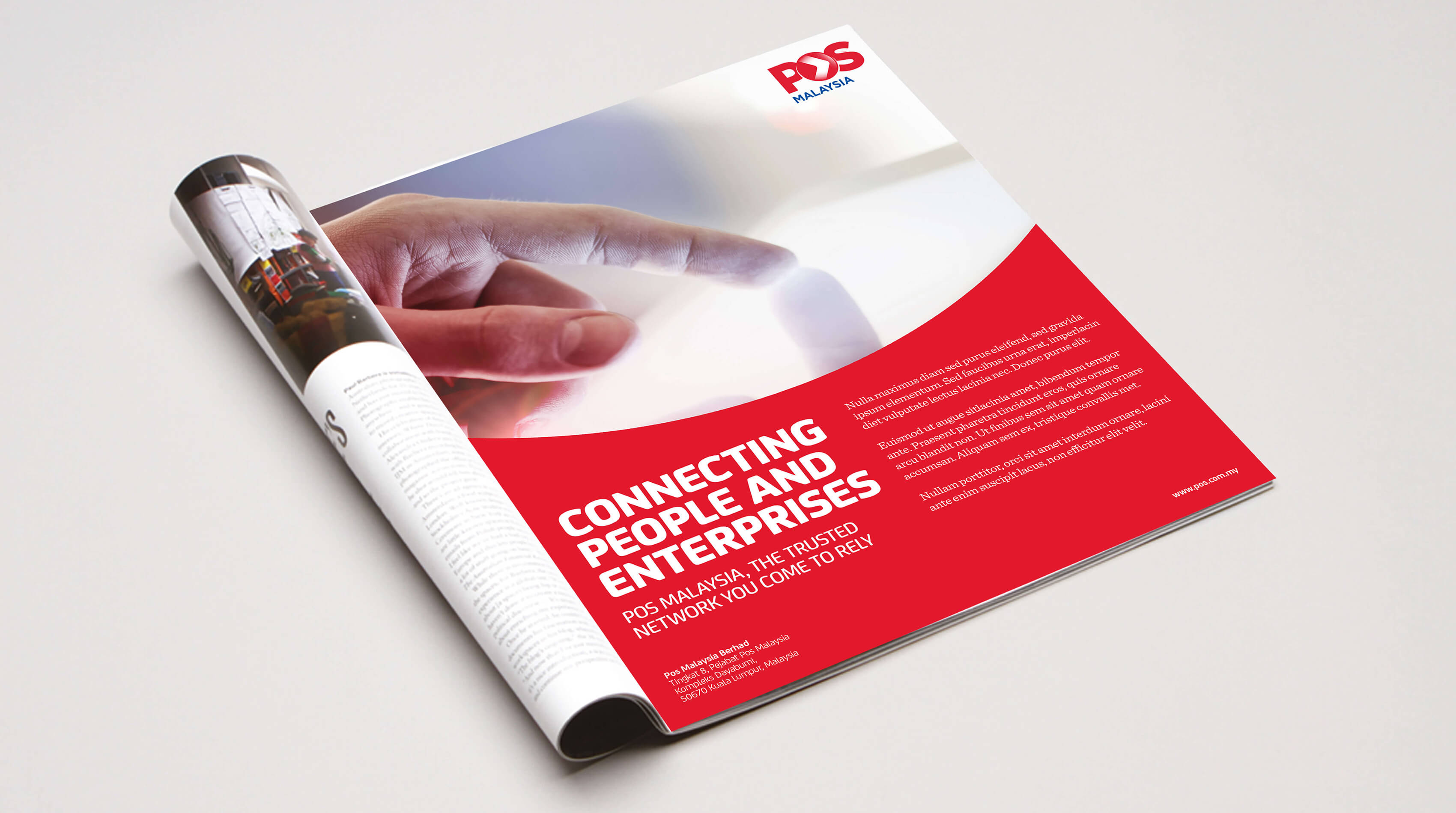
We developed templates and guidelines for crafting bold new campaigns, spanning outdoor to print collaterals. We oversaw the design, specification, and production of signage across all key sites and outlets. The packaging was designed for in-store display by maximising key elements such as colour and weight visibility.

 

https://bonseydesign.com/wp-content/uploads/2020/04/18-1-e1632884554161.jpg
https://bonseydesign.com/wp-content/uploads/2020/04/17-1-e1632884575248.jpg
https://bonseydesign.com/wp-content/uploads/2020/04/11-1-e1632884593903.jpg
https://bonseydesign.com/wp-content/uploads/2020/04/19-1-e1632884628432.jpg
https://bonseydesign.com/wp-content/uploads/2020/04/3-1-e1632884651722.jpg
https://bonseydesign.com/wp-content/uploads/2020/04/20-1-e1632884673102.jpg