CLIENT

POKKA Zero Iced Tea

PROJECT

Zero calories, zero compromise

DISCIPLINE

Brand Packaging Design

CHALLENGE

We’re all mindful of our sugar intake, with warnings about obesity and health risks everywhere. Iced tea, especially the fruity kind, has always seemed like a safer choice. But the global move to cut sugar is unstoppable. While soft drink giants offer zero-calorie drinks with artificial additives, iced tea deserves a more authentic and gentle touch. How can we create a zero-sugar iced tea that truly captures the spirit of tea but without using the expected visual tropes?
SOLUTION

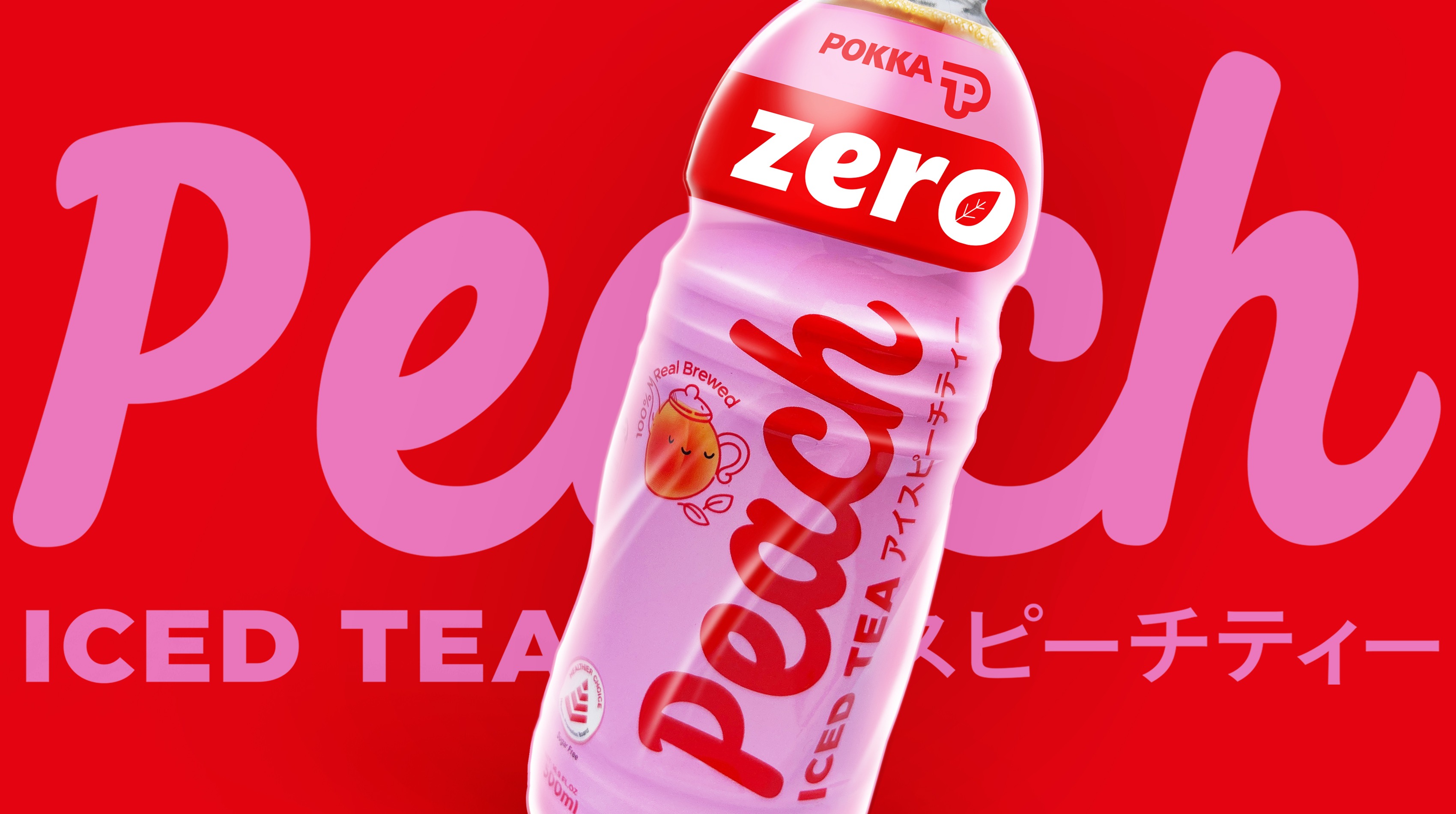
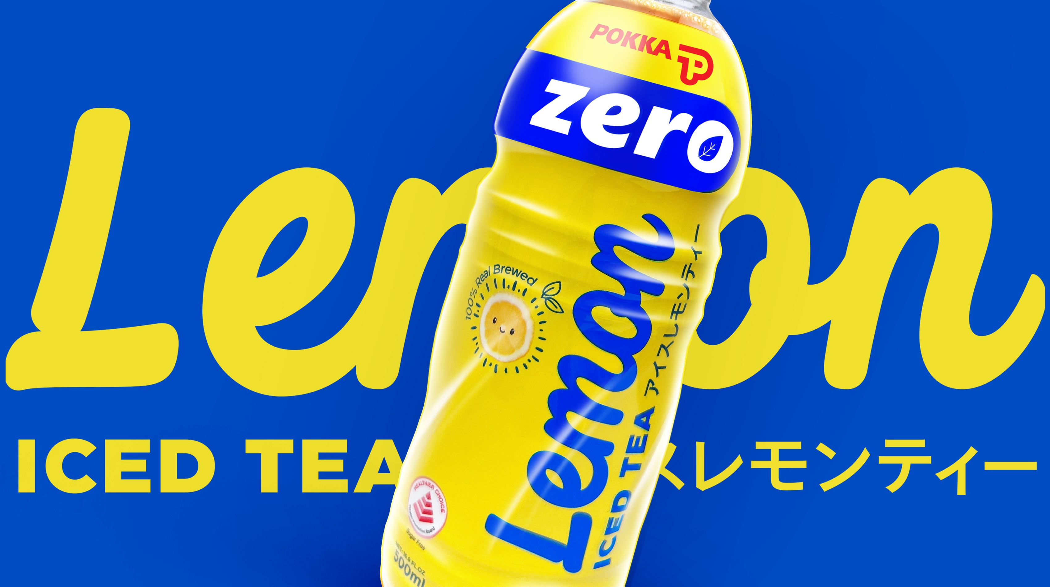
We explored the typical design standards of Zero calorie drinks of silver and black but found they didn’t fit with the fun refreshing fruity tea flavours. They were too austere or sporty and lacked the pleasurable engagement that POKKA is known for.

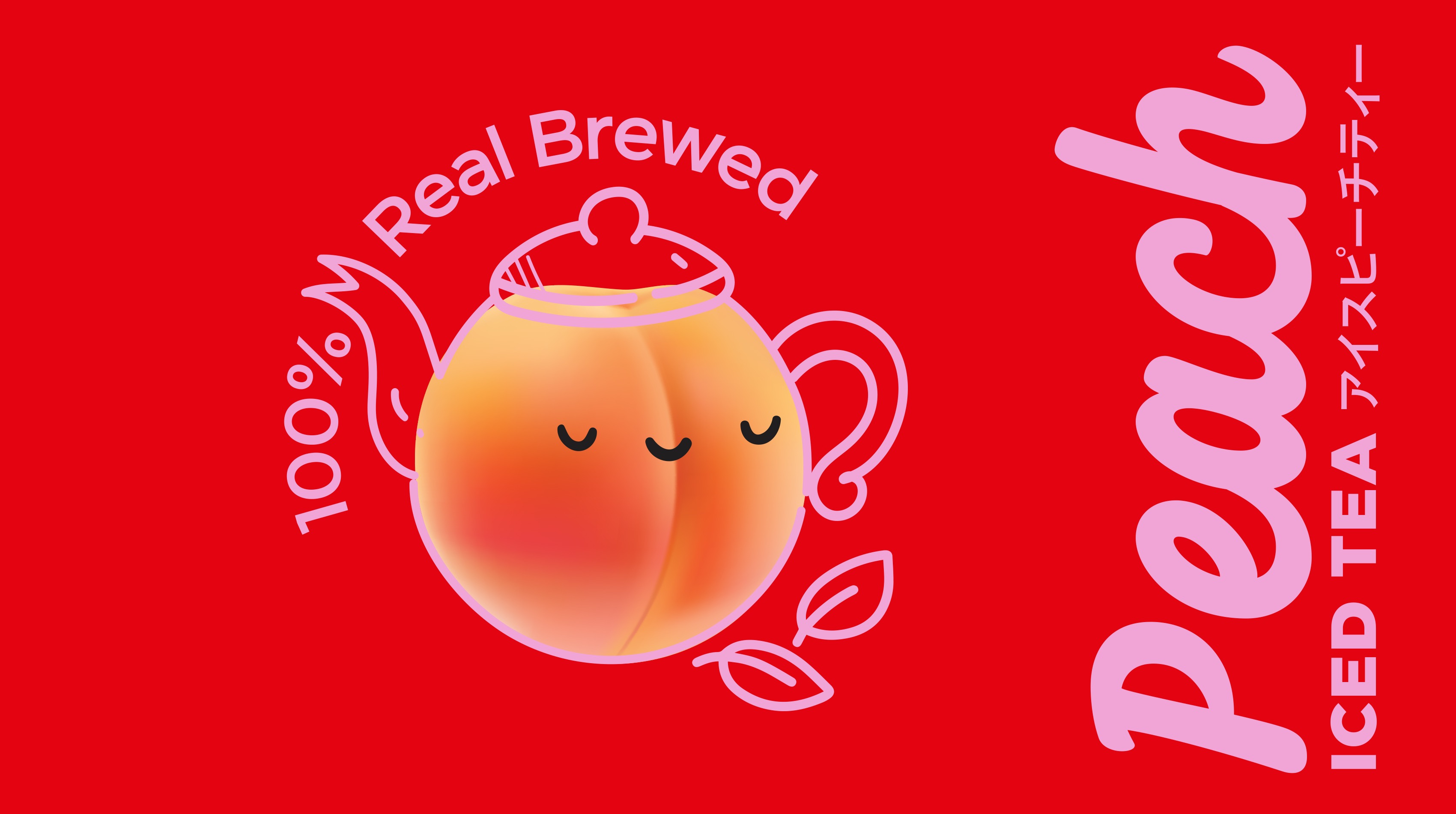
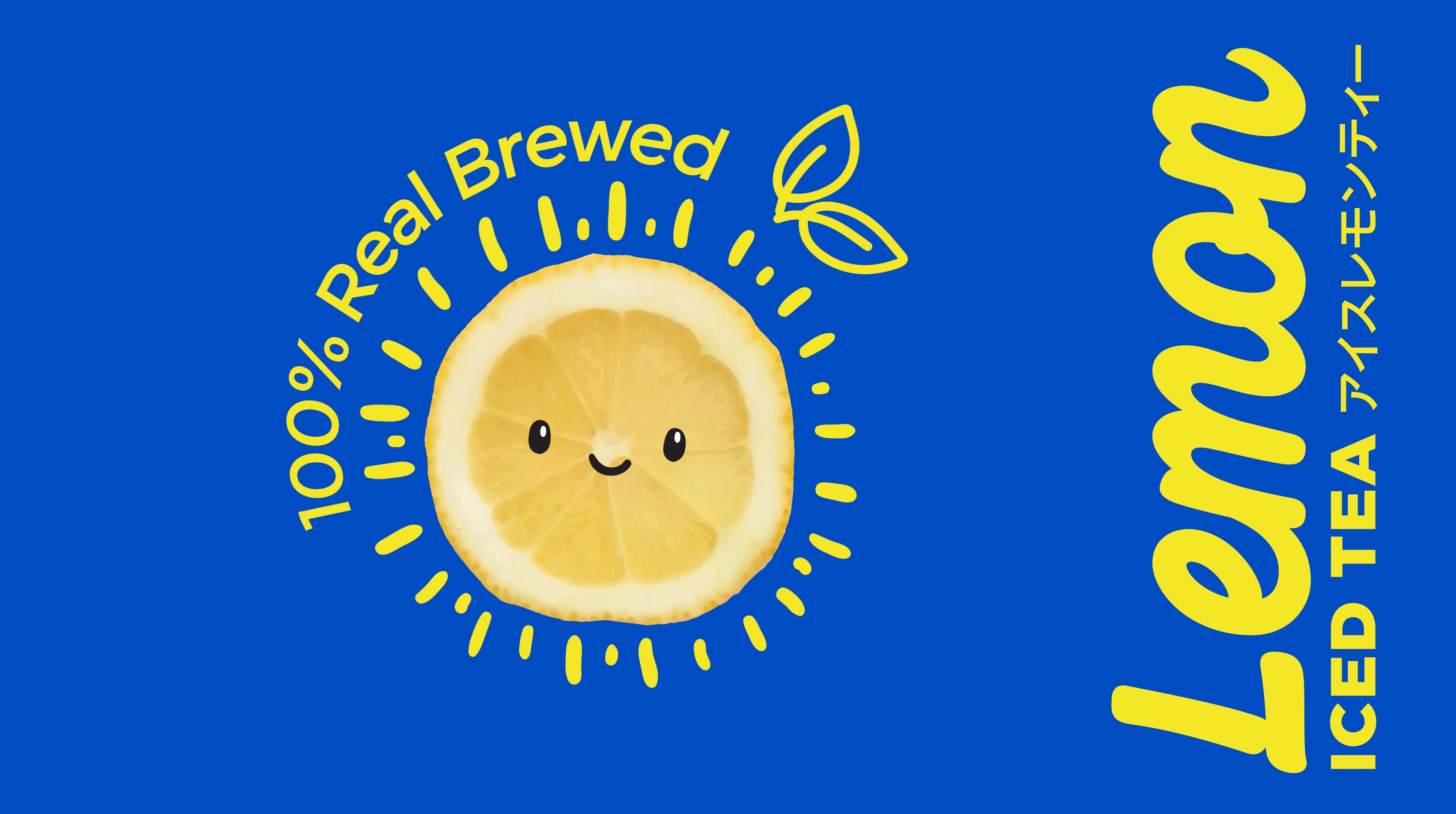
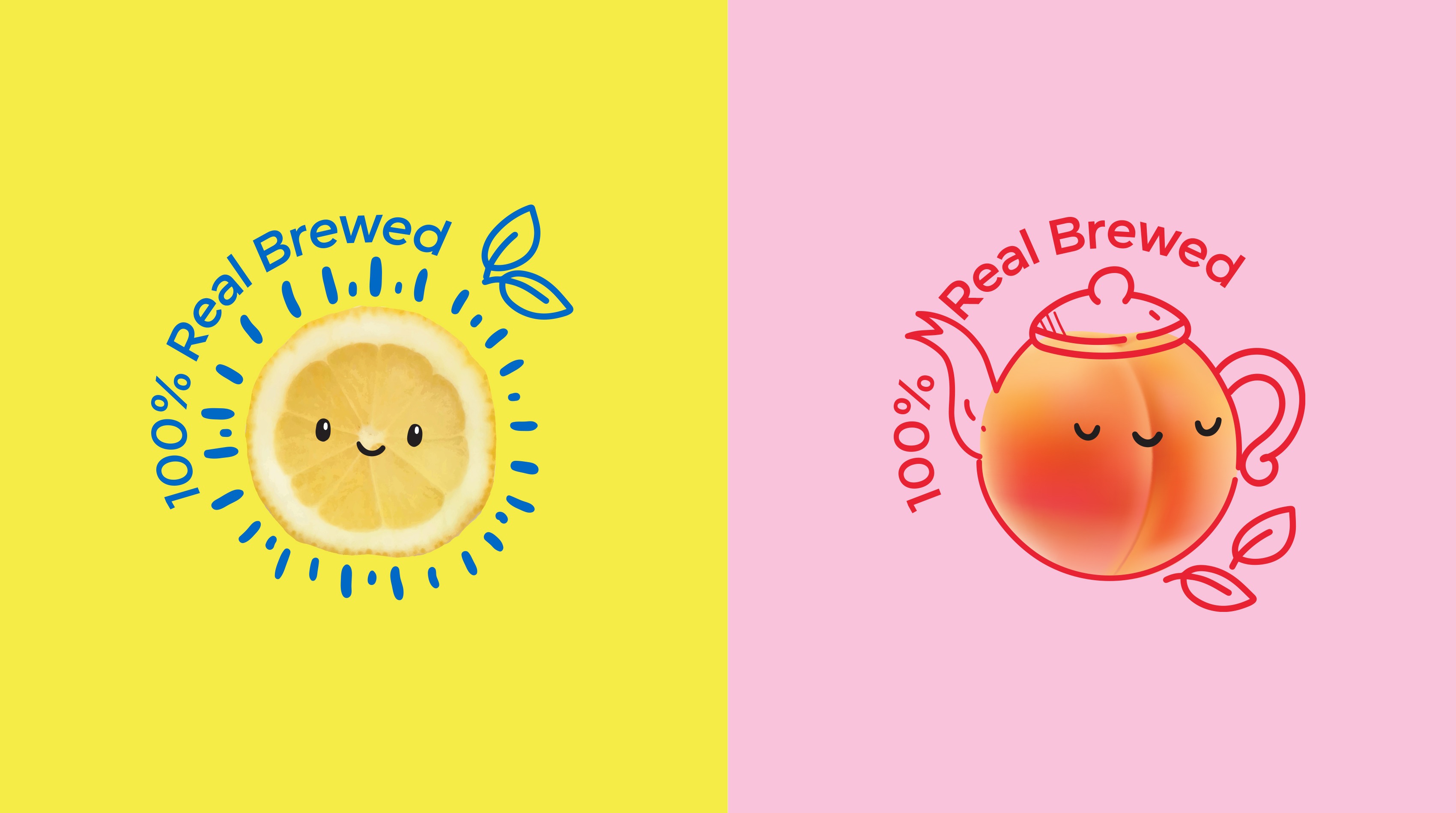
We needed to create a strong Zero sub-brand but one that supported the POKKA positioning. Our solution was to create bright, flat 2-coloured wraps that shout zero but in a simple, fun way. Charming illustrations replaced the usual fruit images and the overall impression is young, different and ‘instagramable’.

https://bonseydesign.com/wp-content/uploads/2024/07/•-WEB-Pokka-1-peach-230724-RGB.jpg
https://bonseydesign.com/wp-content/uploads/2024/07/•-WEB-Pokka-illustrations-Peach-RGB.jpg
https://bonseydesign.com/wp-content/uploads/2024/07/•-WEB-Pokka-illustrations-Lemon-RGB.jpg
https://bonseydesign.com/wp-content/uploads/2024/07/•-WEB-Pokka-1-peach-230724-RGB.jpg
https://bonseydesign.com/wp-content/uploads/2024/07/•-WEB-Pokka-illustrations-Peach-RGB.jpg
https://bonseydesign.com/wp-content/uploads/2024/07/•-WEB-Pokka-illustrations-Lemon-RGB.jpg