CLIENT
Nestlé Bliss
PROJECT
Consolidating category leadership
DISCIPLINE
Insight, Research & Analytics, Competitor Analysis, Packaging Design, Packaging Implementation
Nestlé Bliss is the number one yogurt drink brand in Malaysia, loved by consumers for its great taste and digestive health properties derived from a combination of real fruit juice and live cultures.
Despite leading the Malaysian market Nestlé Bliss was not performing in terms of pack standout and variant differentiation, with more rival brands entering the market. Key benefits such as ‘natural’ and ‘wholesome’ were underplayed on the existing packaging and variant differentiation remained unclear to consumers. To complicate matters further a new premium line, Bliss Plus, was to be introduced to appeal to more health-conscious consumers.
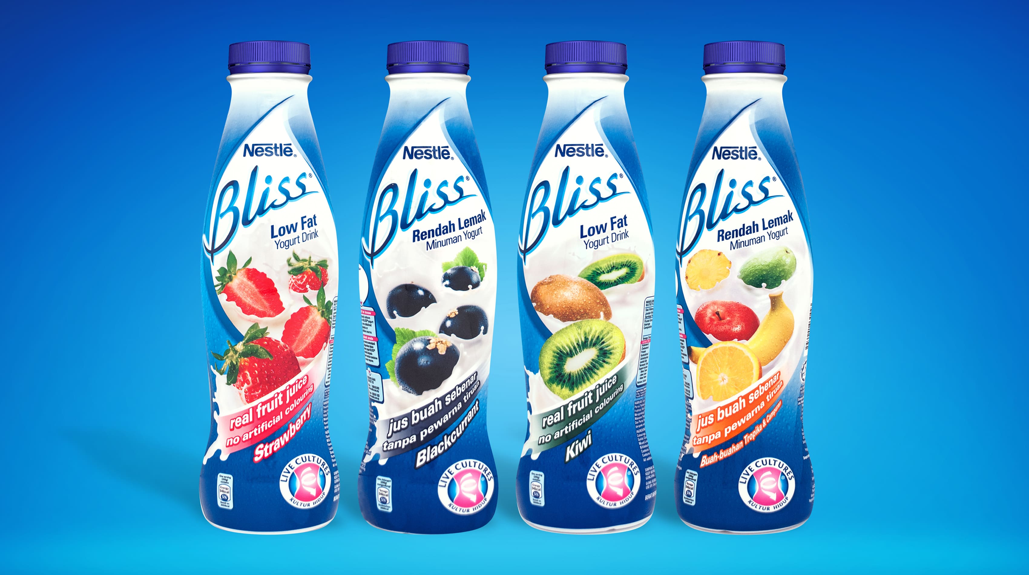
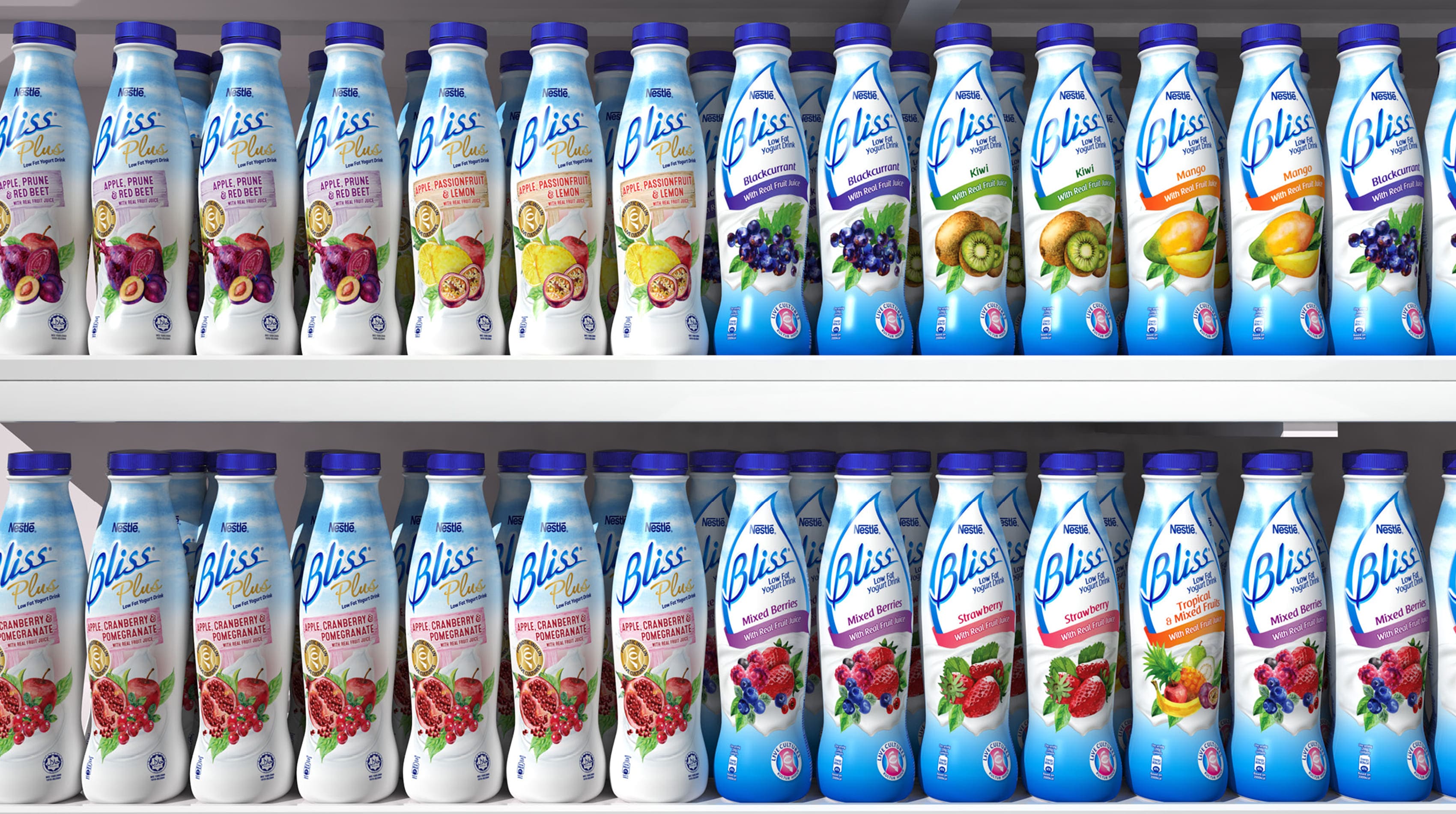
Based on an analysis of the visual equities of Bliss and its competitors, developed a lighter treatment that retained the distinctive ‘cartouche’ and introduced a natural sky blue palette.
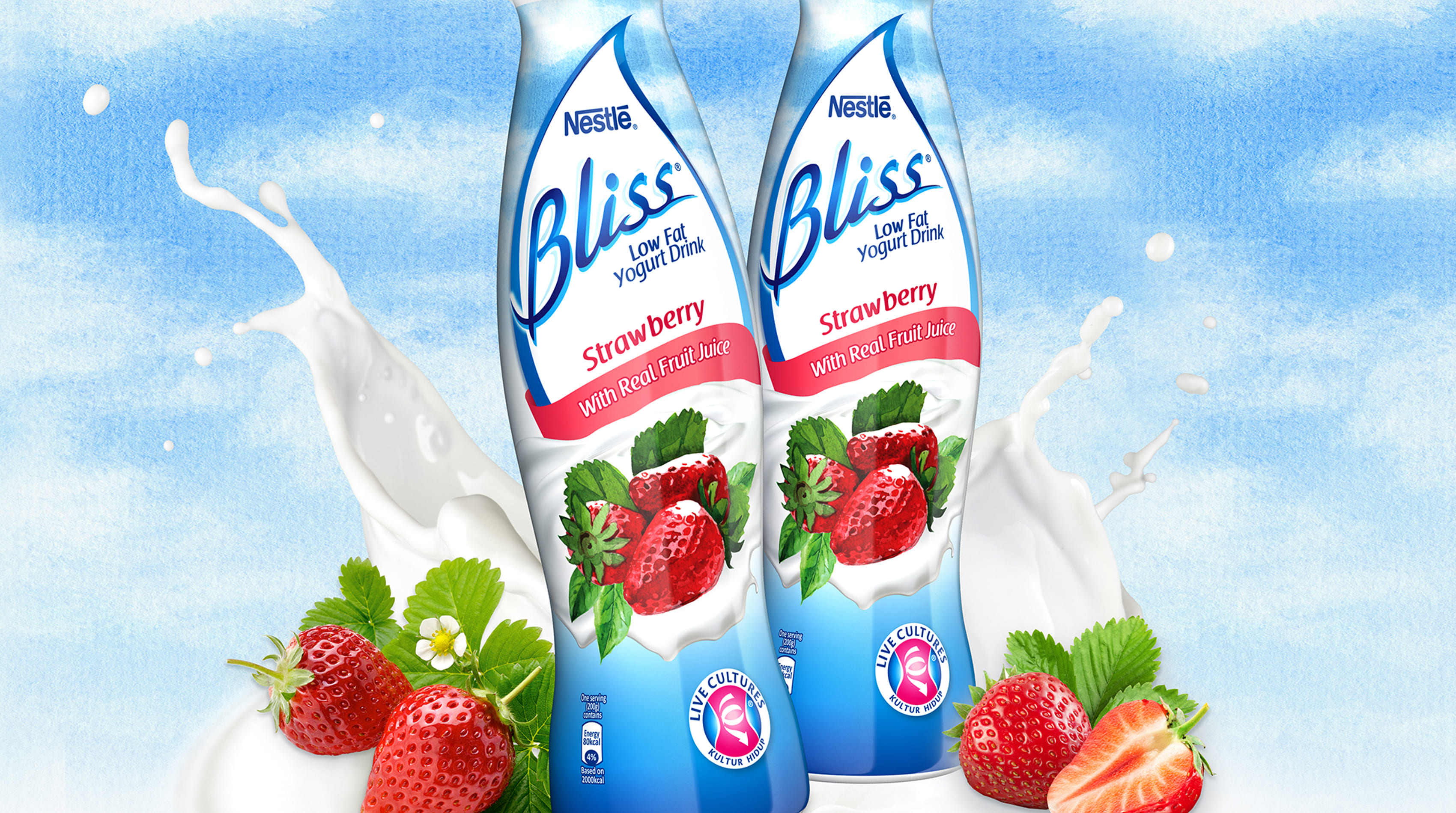
The treatment of the fruit was made more naturalistic to increase appetite appeal and a colour-coded variant system was introduced to aid on-shelf navigation.

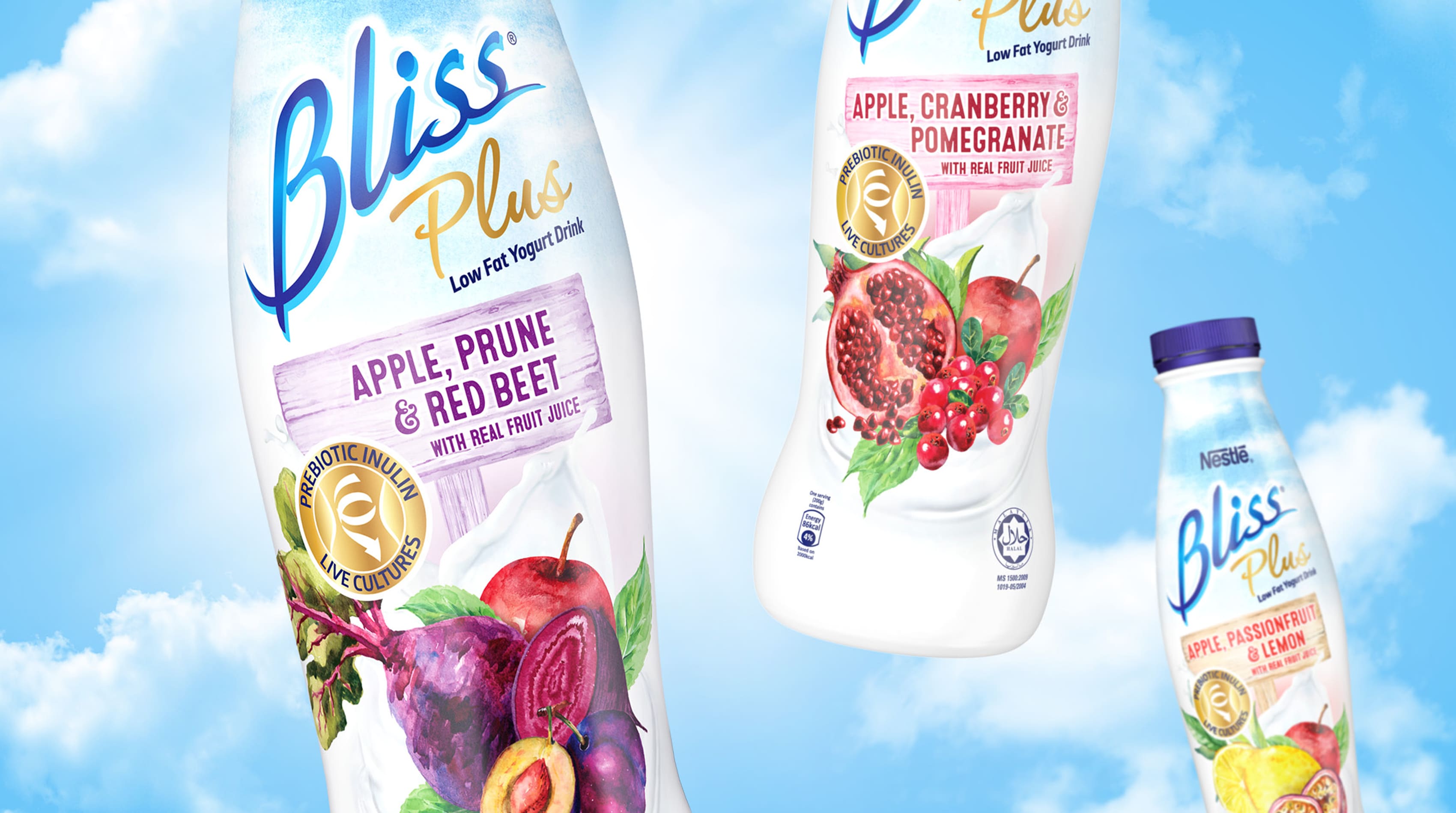
For Bliss Plus, the packaging colour was lightened further to project purity and wholesomeness and the fruit imagery was given a more premium touch with an artisanal watercolour style that was also extended to the variant system. The ‘Plus’ sub-brand and nutritional benefits were highlighted in gold to complete the premium look.
The packaging refresh and line extension provided just the fillip that the brand needed, consolidating its leadership in the Malaysian market and underlying sales increases and expansion across the region.