CLIENT
Magnolia
PROJECT
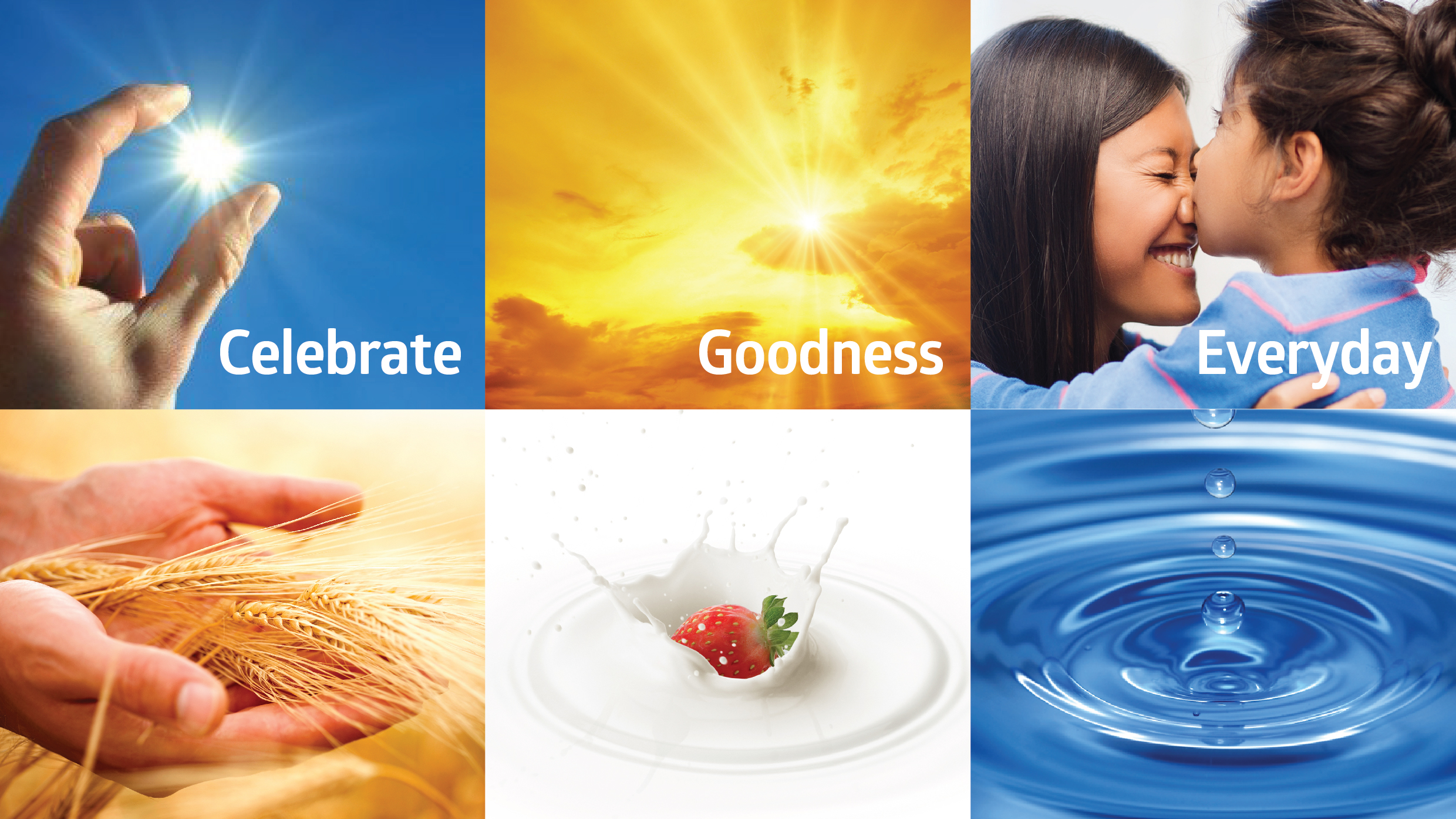
Celebrating goodness every day
DISCIPLINE
Competitor & Customer analysis, Brand Positioning, Customer Value Proposition, Corporate Identity, Brand Guidelines
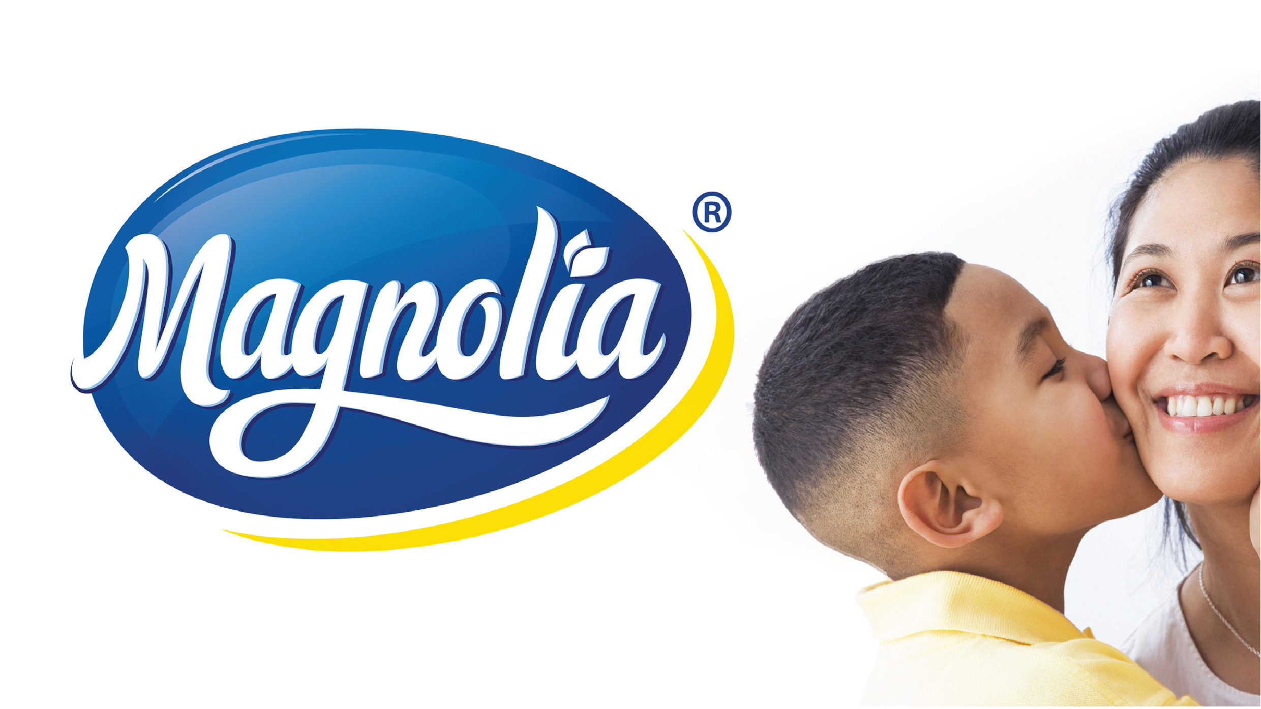
Over 90 years Magnolia had grown to be one of the most loved brands in Filipino homes, offering a wide range from dairy products, snacks, beverages, to fresh chicken. Research showed Magnolia had some key weaknesses in brand presentation, with the logo recessive, hard to find on the pack and hard to read. Improving shelf impact was vital and urgent and a design system was needed to help shoppers locate it in multiple categories spread across the store. With many products below 5% share spread across multiple categories, we needed to build a brand house style to add ‘visual glue’ that would hold the brand together.
To begin we refreshed the brand essence of Magnolia; Celebrate Goodness Every day. This was designed to speak directly to mothers and to help them believe in Magnolia as the brand that consistently celebrated them in their daily challenge of providing quality nutrition to their families.
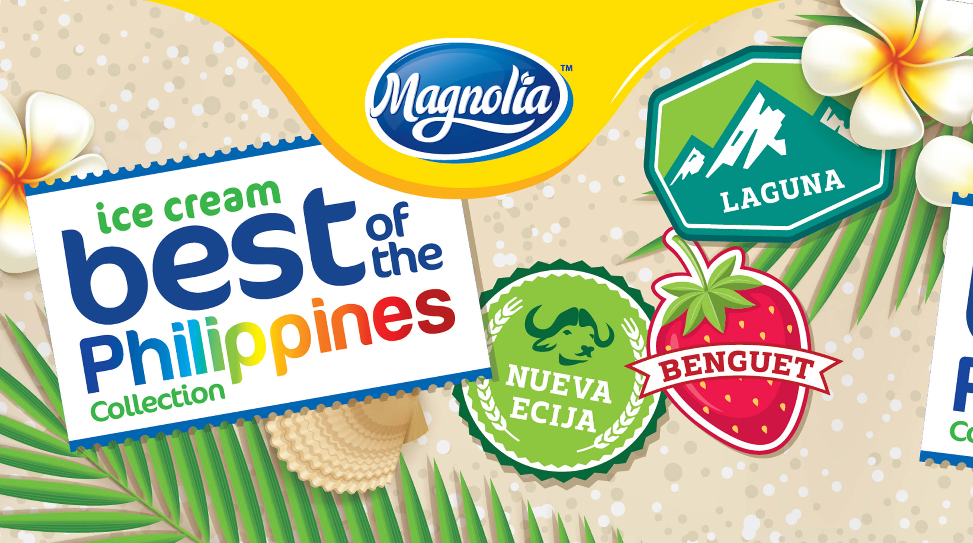
Next we explored the symbol of Magnolia. Research showed that the brand was hard to read on shelf so our design team crafted a series of designs that respected the 90 year heritage but that would be competitive in the 21st century. The new identity improved legibility by 50%, adding tonality and polish that increased the modernity and appetite appeal. We added a golden halo that complemented the rich blue of the brandmark and helped it ‘pop’ off the shelf. The gold halo speaks of a brighter tomorrow for all Filipinos.
Working with the most popular products of the portfolio we built a graphic identity system dubbed the Golden Wave against which the Magnolia brandmark would shine, regardless of category, package design or retail constraints. This would connect the brand strongly across categories regardless of their location in-store.
Our package design team then focussed upon the most popular products and redesigned each to amplify the brand and maximise appetite appeal. Working on the Pareto principle we used the most popular 20% of the portfolio to set the standards for the rest of the line, the implementation undertaken by San Miguel’s own team of designers, working under our guidance and using our brand guideline toolkit.
Magnolia is now restored to its rightful place as the kitchen ‘Life Partner’ for all Filipinos. The refreshed brandmark and new design system has given the business a new lease of life and is internationally recognised as a text-book case in respectful management of heritage brands.