CLIENT
BPI
PROJECT
Updating a national icon
DISCIPLINE
Business Model Assessment, Competitor Analysis, Brand Purpose & Visioning, Brand Positioning,
Corporate & Product Brand Architecture, Corporate Identity & Guidelines, Customer Experience & Environments
Philippine banking was born on August 1, 1851, with the establishment of the El Banco Español Filipino de Isabel II – or what we know now as Bank of the Philippine Islands (BPI). It was also the first bank in Southeast Asia.
In its over 168 years of existence, BPI’s history is closely intertwined with the Philippines’ narrative of progress and development. The bank’s pioneering efforts in mobilizing industries such as agriculture and transportation, as well as its milestones in modernizing and globalizing financial transactions, all contributed to its current status as one of the most trusted organizations in the country.
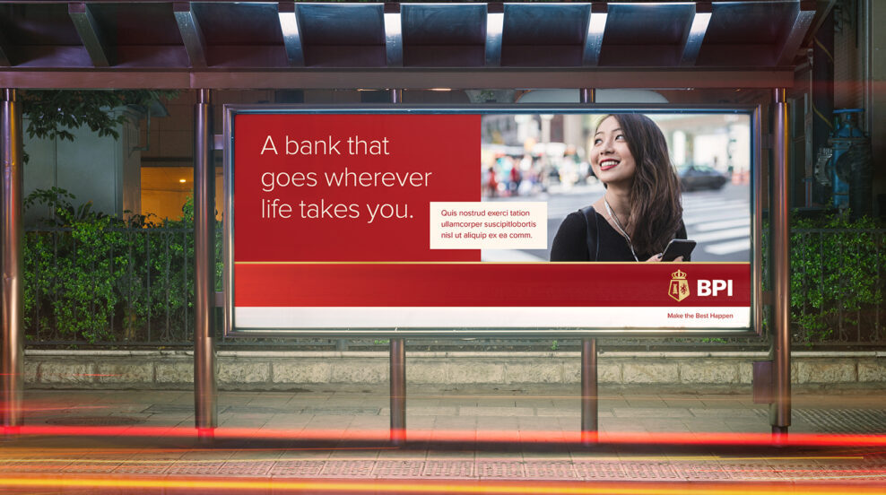
BPI, however, recognised the need for a new identity that will future-proof their brand. An identity that will allow it to stand out in this 21st century digital world, visually communicate its new vision, mission & customer value proposition, and appeal to the new millennial market, whilst maintaining its centuries-old heritage.
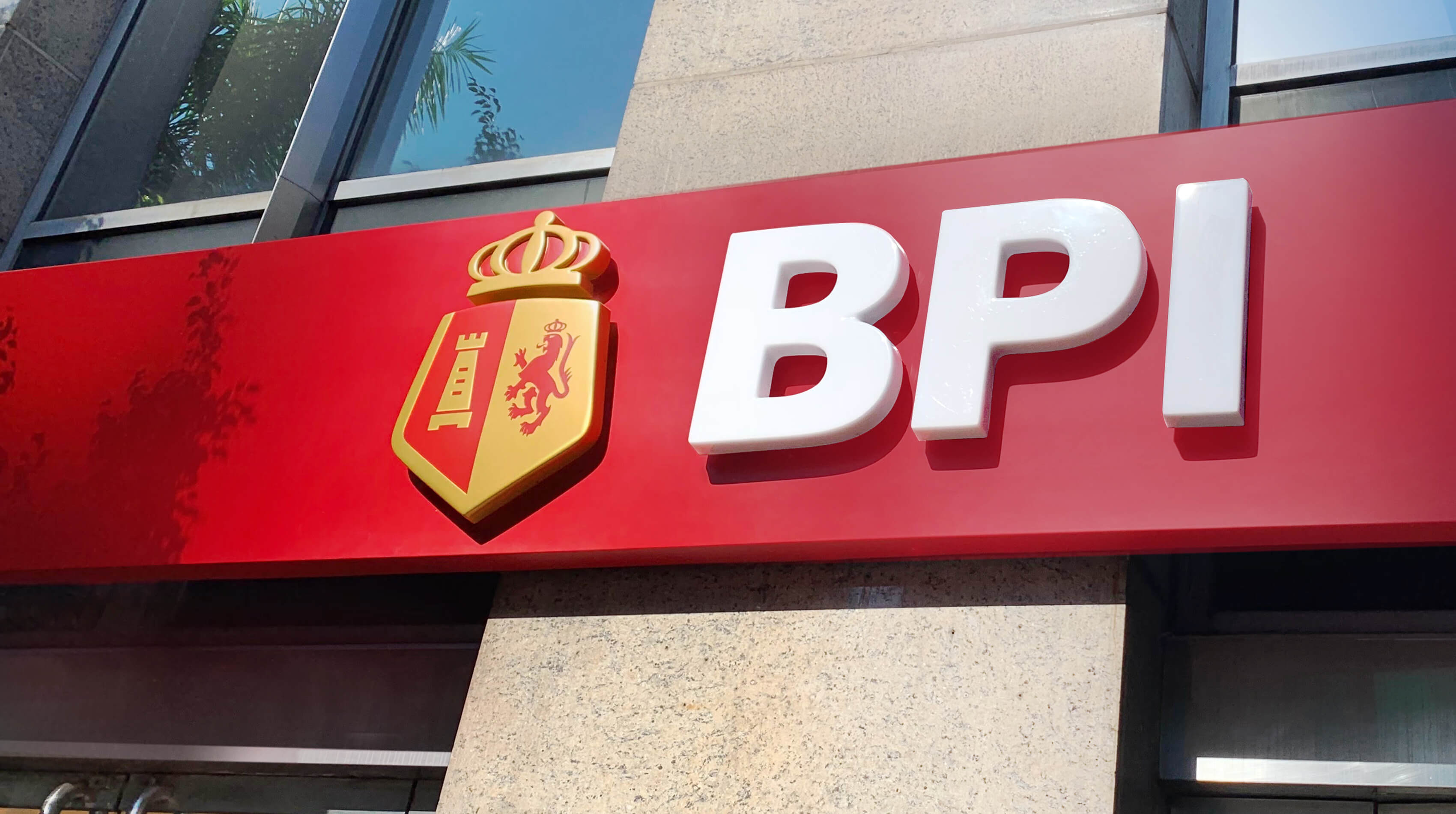
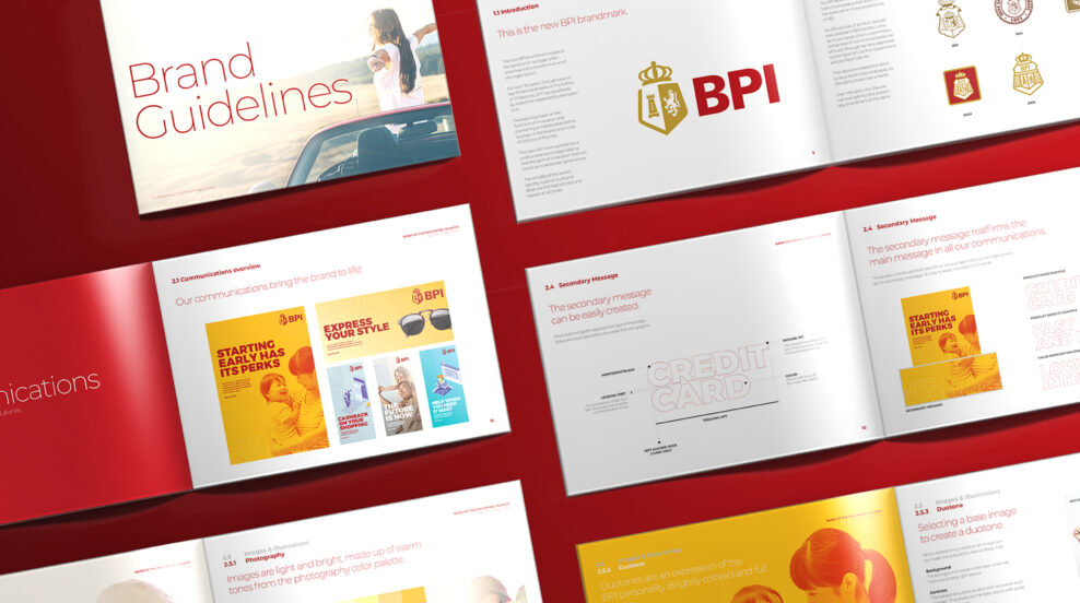
While the Escudo has evolved over the years, BPI’s brand values remain the same. The new Escudo amplifies four essential elements of the historic symbol – The crown, the shield, the tower and the lion rampant.

The crown and the gold symbolizes the trust that comes with the rich legacy of the bank. The shield protects and together with the open top left edge, allows the greater sense of open-ness and accessibility. The tower symbolizes the responsibility to guard people’s faith in the bank, and the Lion epitomizes the courage to do what is good and right at all times.

The wordmark is modified to match the modernity of the new escudo. A customised font, it’s intentionally made to look sharper, bolder and more defined in shape, aimed to increase its impact, visibility and legibility.

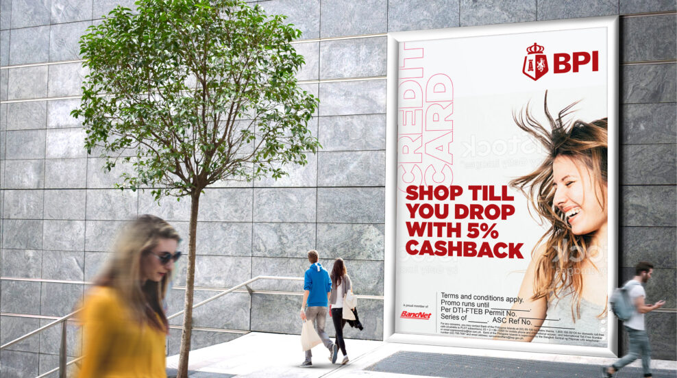
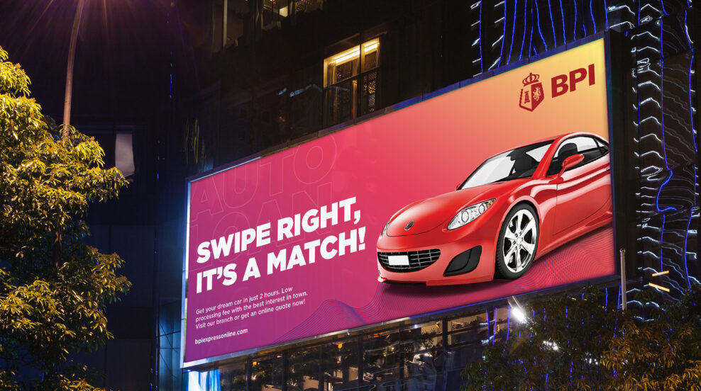
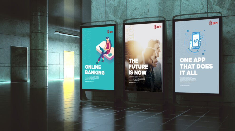
BPI’s new identity is designed to work effectively on traditional as well as digital media. It embodies Bonsey Design’s design philosophy of simplify and amplify. The reduced complexity has given more room for the important parts to shine, thus increasing relevance and appeal for today’s connected generation.
Based on an initial logo testing conducted by BPI in Q2 of 2018, it showed that 63% of the respondents liked the new identity and in a blind brand text, 83% of the respondents were able to identify it as BPI.