CLIENT

Astro

PROJECT

Revitalising Malaysia’s media and entertainment pioneer.

DISCIPLINE

Brand Positioning, Brand Identity, Brand Architecture, Guidelines, Brand Engagement

CHALLENGE

Evolving Malaysia’s legacy entertainment brand for a streaming future.
Astro, Malaysia’s leading entertainment and media company, has gone through various evolutions since its launch in 1996, but with the market shifting further towards on-demand streaming and digital-first experiences, the company faced increasing competition from global streaming platforms and disruptors.

Read more

Astro’s product ecosystem, original programming and social media outreach had all expanded considerably,  but a more cohesive corporate identity was needed to reinforce its position as the country’s premier content aggregator. To stay relevant and extend appeal to new audiences, the brand needed to more evidently evolve beyond its traditional pay-tv roots, aligning its various sub-brands and services under a clear, unified identity. The challenge was not just about aesthetics; it was about repositioning Astro as a modern, future-ready media powerhouse that could engage younger, digital-savvy audiences while maintaining trust with its existing customer base.

SOLUTION

The first step was to develop a fresh proposition for Astro that properly reflected its new reality, and which would become the foundation for all brand and product communications going forward.

Read more

As the dominant force in satellite pay-TV for decades, consumers’ perception lagged the reality of how Astro was ramping up its original programming, streaming services and customer experience.

We developed the proposition and supporting brand manifesto ‘DISCOVER AMAZING’ to reflect the quality and surprising diversity of Astro’s content and to encourage reappraisal among consumers.

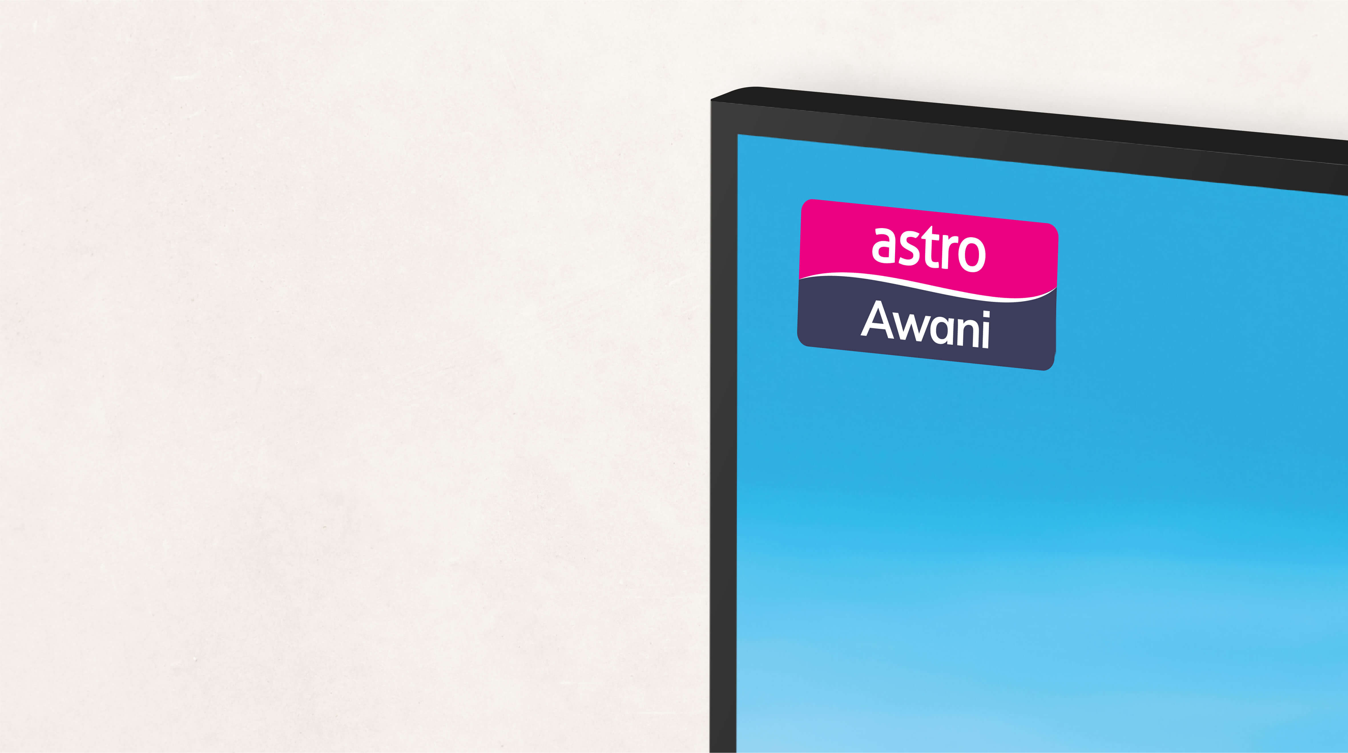
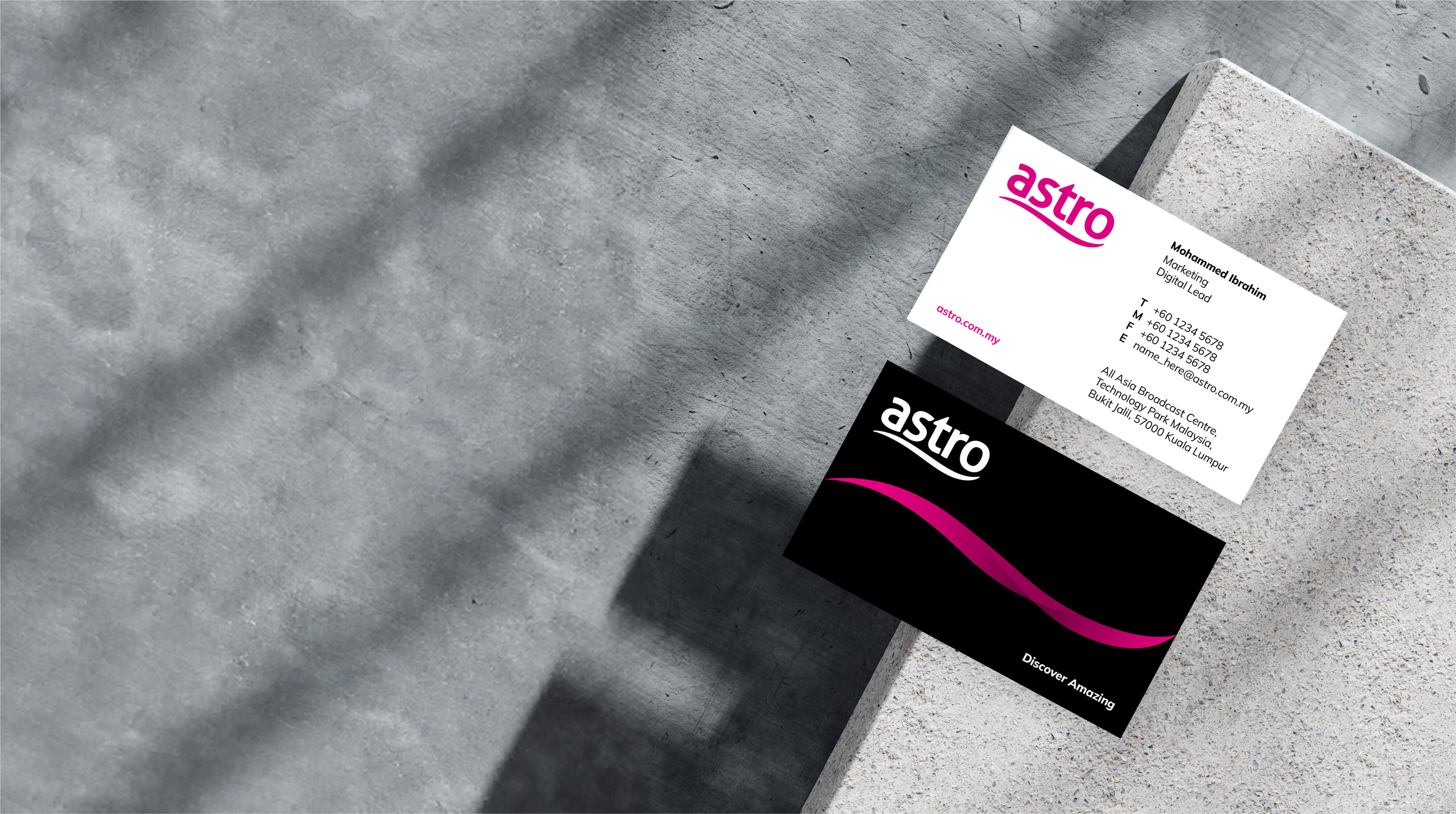
The Astro logotype is a fundamental building block and signpost of the brand, working across everything from corporate and brand communications to product and channel architecture and on-screen “bugs” (digital on-screen graphics.

Read more

Recognition levels of the existing Astro logo are so high, that radical changes to it were not advisable, but we introduced several technical and typographic enhancements that made it stronger as a symbol in its own right, and a more compact, distinct usable and element to work across Astros’ increasingly diverse product and channel ecosystem.

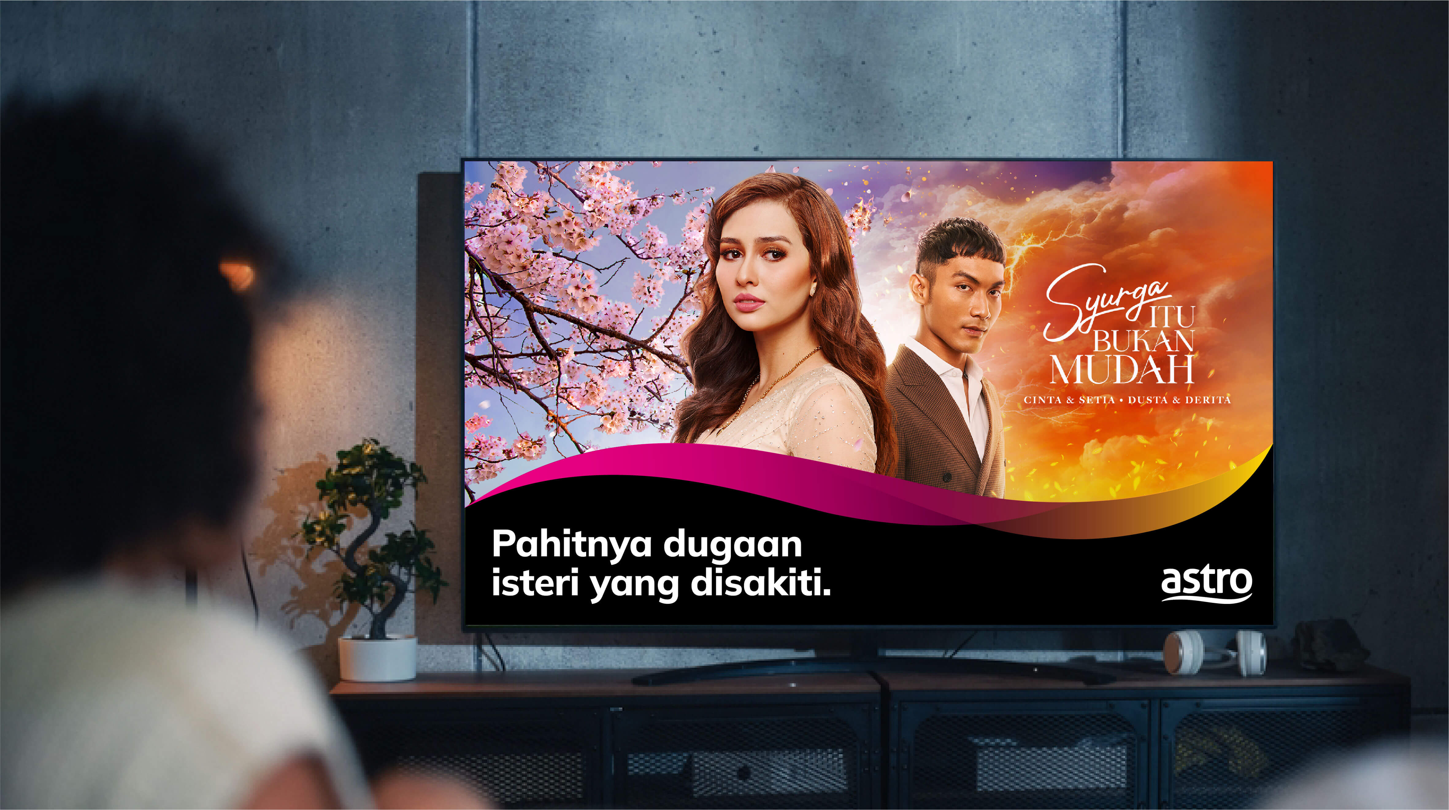
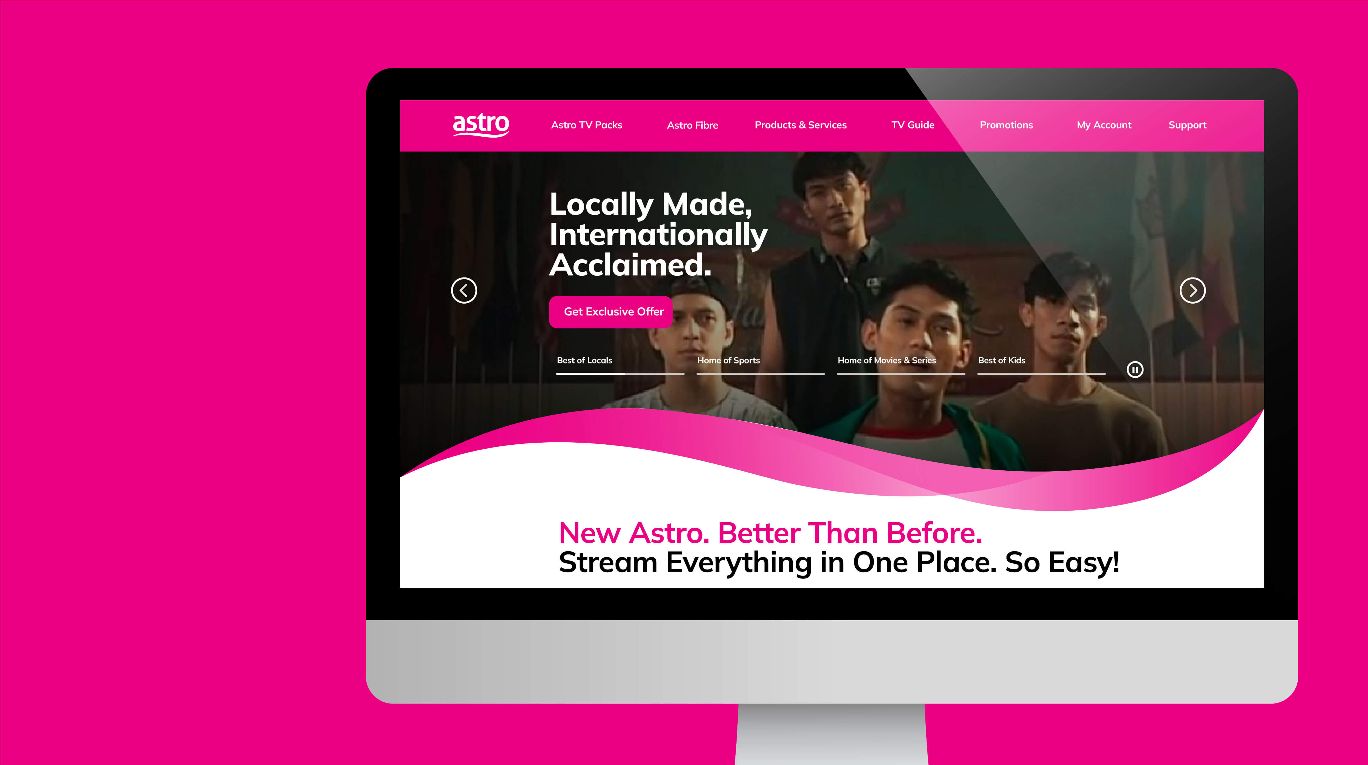
To support the new logo, we introduced a new visual system built around a fresh, dynamic interpretation of Astro’s distinctive ‘Qi’ wave device.

Read more

By introducing more elegant detailing and a variety of gradated colour options, combined with a modular system allowing the ‘wave’ to be used in a variety of treatments, orientations and formats, we created a system that can be used flexible across all corporate and brand platforms. The introduction of this system was a further step in associating Astro more strongly with its content and products and asserting its digital streaming credentials.

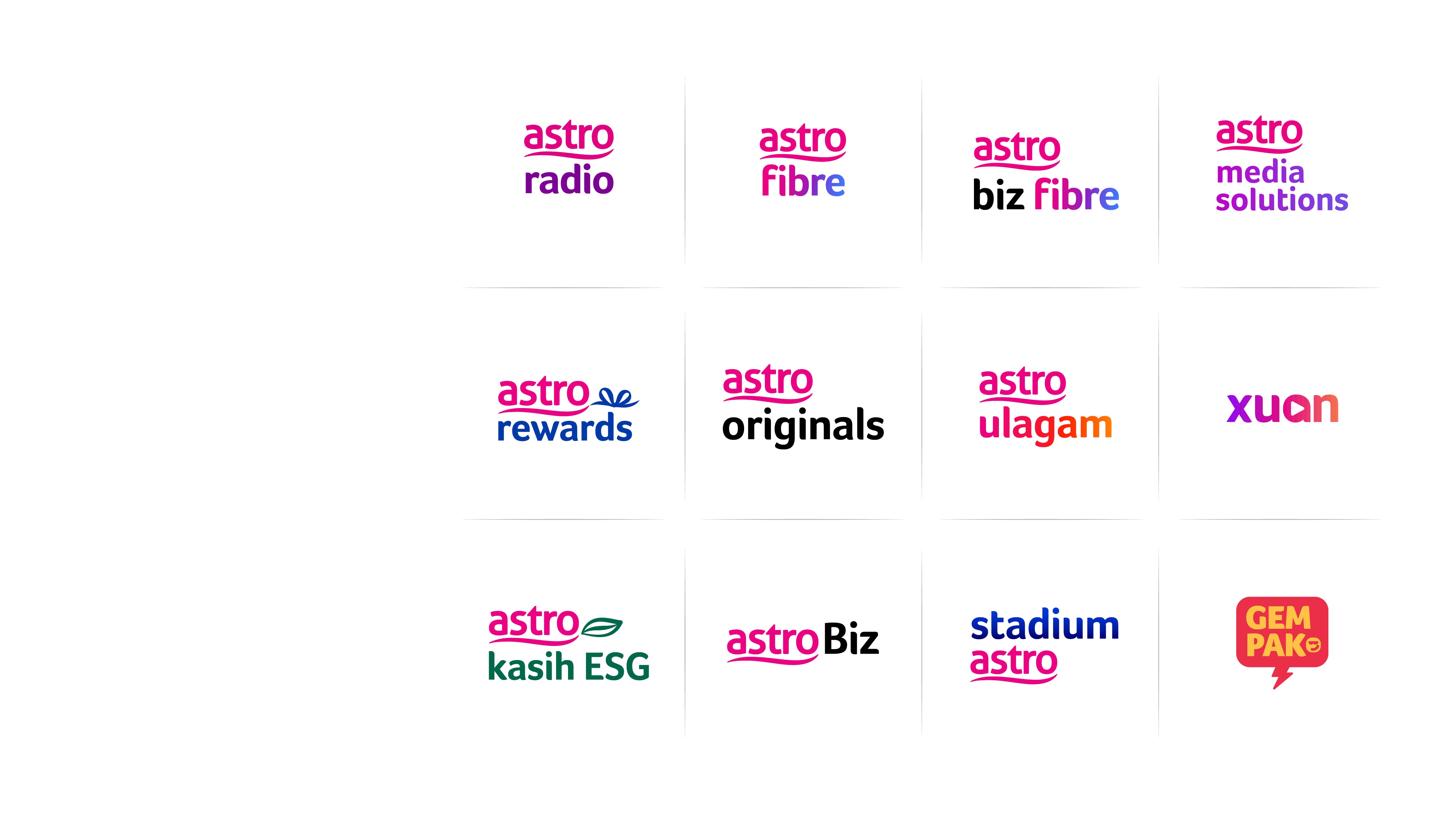
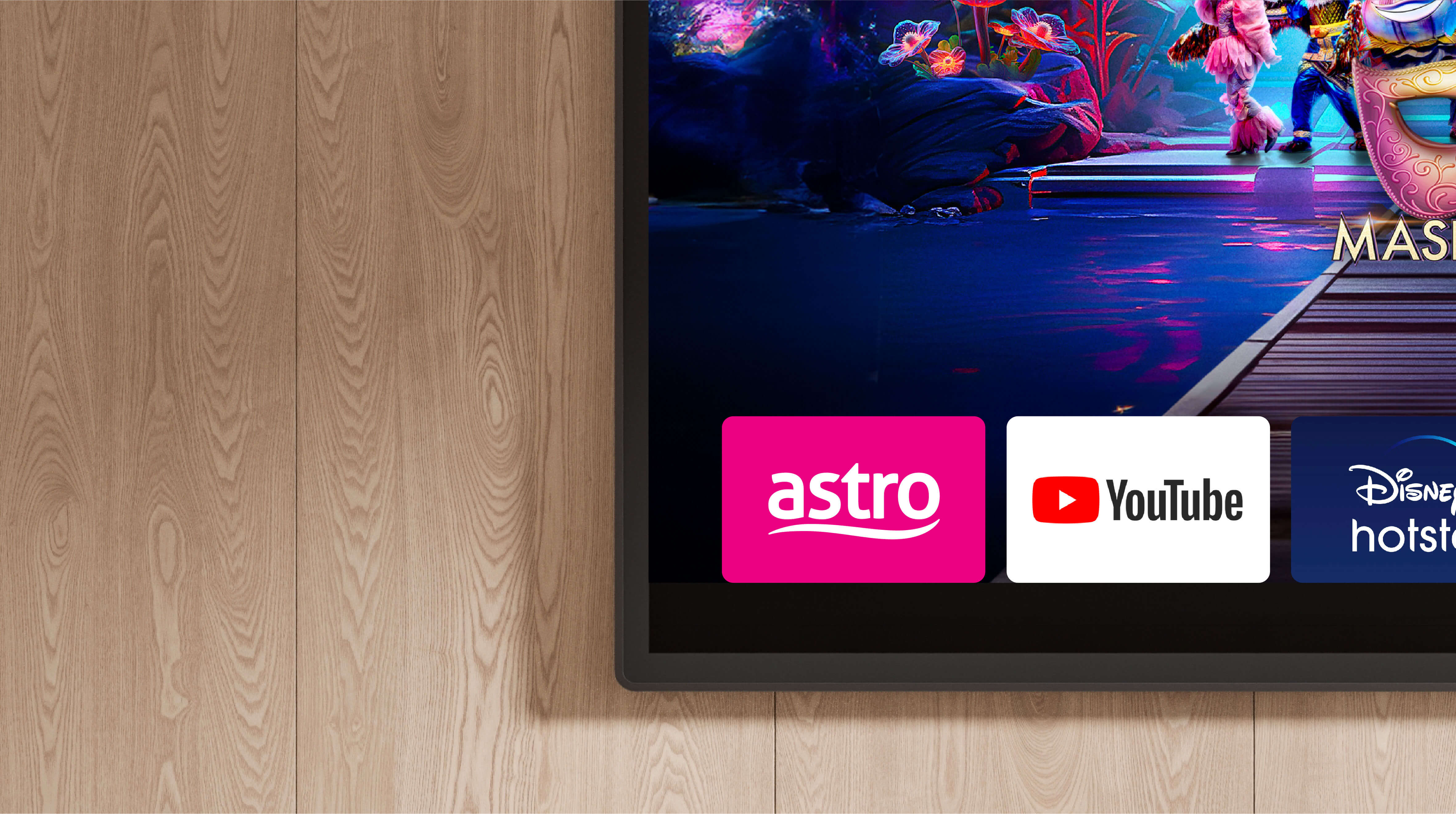
Astro has a host of other corporate brands, digital content brands and apps that had evolved over time with limited systemisation.

Read more

Aligning with the principle of creating more consistency across this suite of brands and more powerfully driving the connection to the Astro Masterbrand, we developed a more systemised approach across the board for arrangement, typography and colour strategy. The result was a much clearer and more harmonised visual architecture in which even ‘standalone’ digital content brands could be connected to the Astro parent.

For many years, the dozens of channels across categories such as Sports, News, Malay, Chinese and Indian content had employed their own colour and typographic interpretations of the channel logo.

Read more

Over time, this created an overly complex visual architecture which became increasingly challenging to maintain and which – crucially – was underplaying Astro’s role in bringing this rich and diverse content together under one platform.

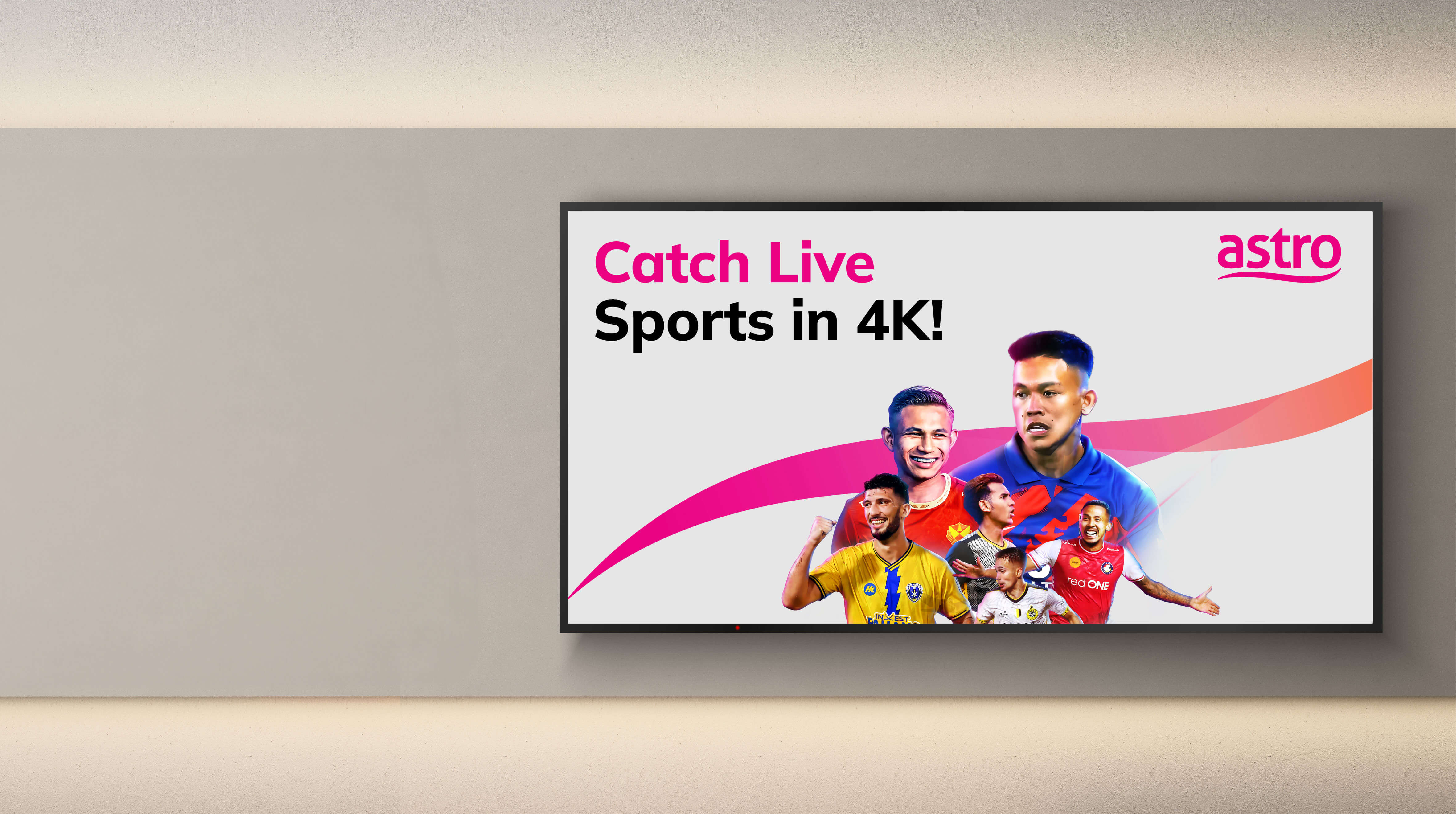
Our detailed design exploration determined that the best way forward was to introduce a standardised visual system anchored by Astro’s distinctive magenta identity and introducing a new font. This system was rolled out first to the Sports channels before being extended across the entire suite of Astro channels.
For many years, the dozens of channels across categories such as Sports, News, Malay, Chinese and Indian content had employed their own colour and typographic interpretations of the channel logo. Over time, this created an overly complex visual architecture which became increasingly challenging to maintain and which – crucially – was underplaying Astro’s role in bringing this rich and diverse content together under one platform.

Our detailed design exploration determined that the best way forward was to introduce a standardised visual system anchored by Astro’s distinctive magenta identity and introducing a new font. This system was rolled out first to the Sports channels before being extended across the entire suite of Astro channels.

RESULT

Creating a winning brand and customer experience.
Astro’s ‘DISCOVER AMAZING’ commitment was revealed as part of the Annual Report in May 2024. Since then, elements of the design system have rolled out progressively to coincide with key product and content updates, such as the introduction of ‘Astro One’ simplified streaming packaging in December of the same year.

Read more

Beyond creating greater consistency and efficiency, the aim of the branding programme was to help shine a light on the great work already being done to make Astro more innovative, accessible and indispensable. Working in tandem with these initiatives, the brand refresh has contributed to strong business performance, with Astro’s results in October reporting a jump in quarterly net profit and subscription revenue growing 2% on a quarter-by-quarter basis after five consecutive quarters of decline.
https://bonseydesign.com/wp-content/uploads/2025/01/Astro-Case-study-09.jpg
https://bonseydesign.com/wp-content/uploads/2025/01/Astro-Case-study-11.jpg
https://bonseydesign.com/wp-content/uploads/2025/01/Astro-Case-study-15-1.jpg
https://bonseydesign.com/wp-content/uploads/2025/01/Astro-Case-study-04.jpg
https://bonseydesign.com/wp-content/uploads/2025/01/Astro-Case-study-12.jpg