CLIENT
Ariel
PROJECT
Managing the laundry giant for regional growth
DISCIPLINE
Competitor Analysis, Brand Architecture, Packaging Design
To P&G, Ariel isn’t just a laundry detergent it is the crown jewel in their laundry portfolio. With its superior technology for whiter, cleaner clothes, P&G wanted Ariel to consumers from the chore of hand-washing.
span style=”font-weight: 400;”>However, consumers weren’t convinced this billion-dollar brand was as innovative as Surf or Tide. Its packaging and messaging simply weren’t compelling enough to support Ariel’s premium pricing.

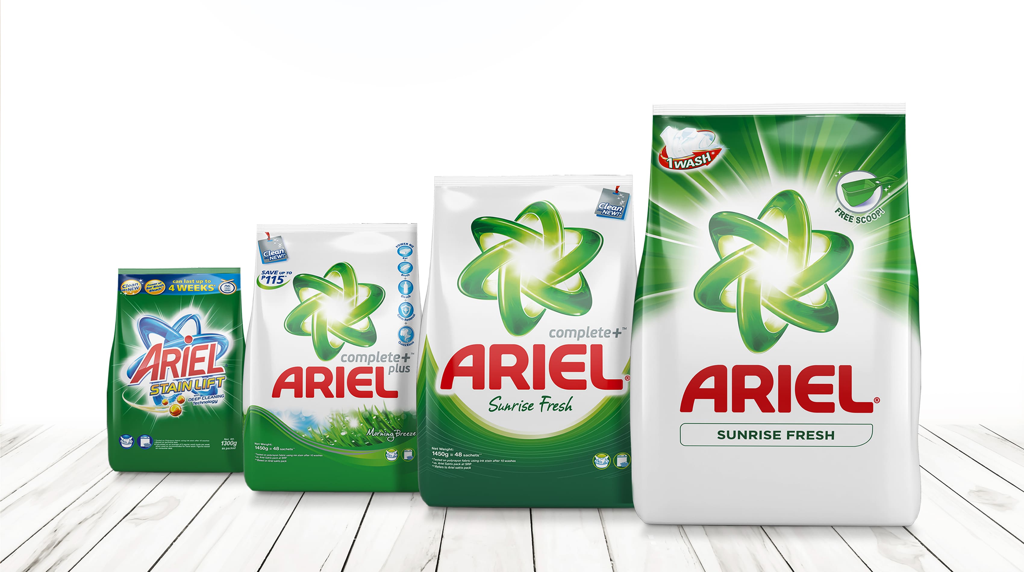
We first created a comprehensive database of all Ariel variants in the Philippines, India, Vietnam, Singapore and Malaysia markets. We ‘dissected’ the pack’s elements to simplify and amplify their value. The results informed a new pack architecture that would translate easily across all variants and markets.
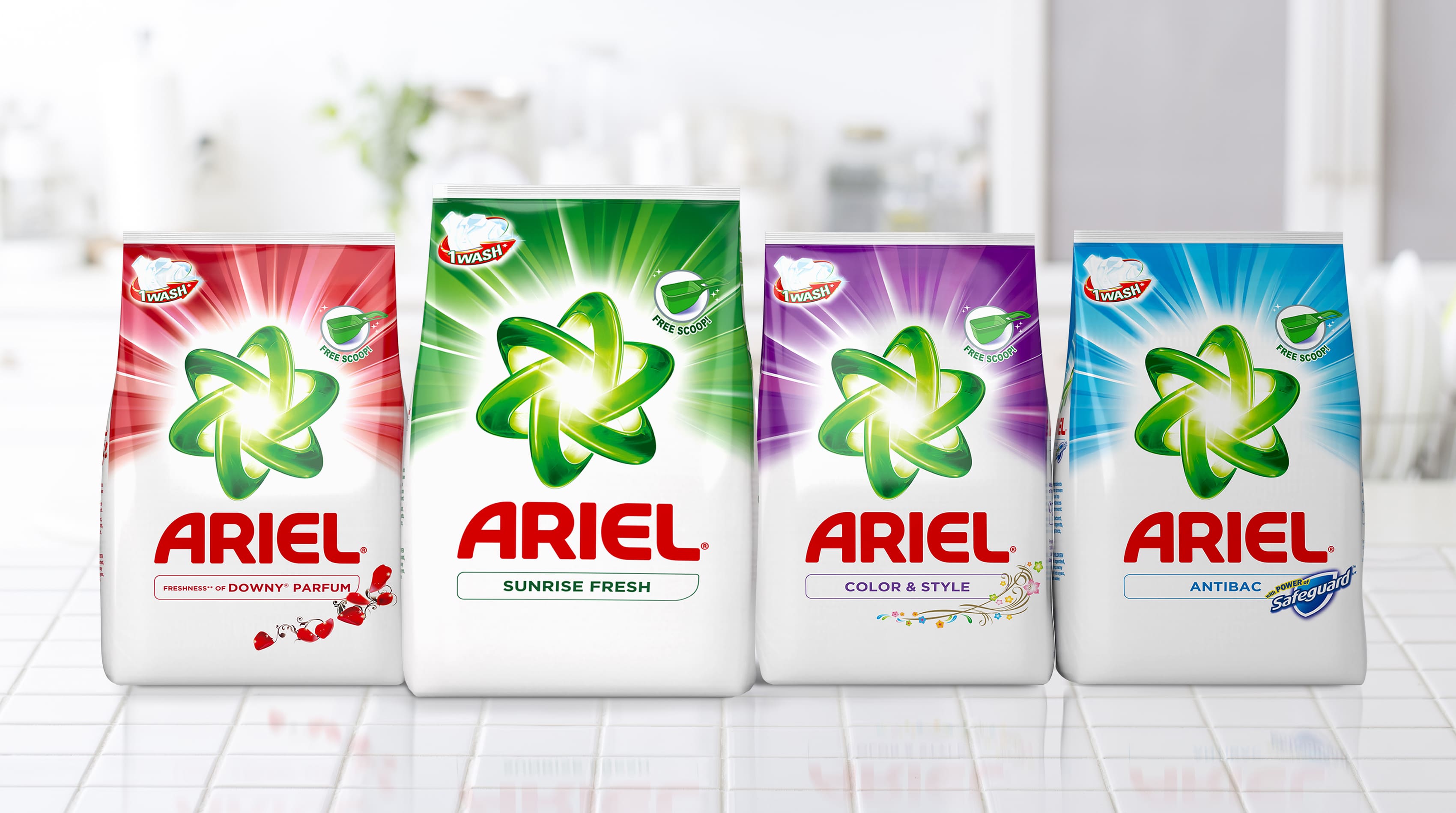
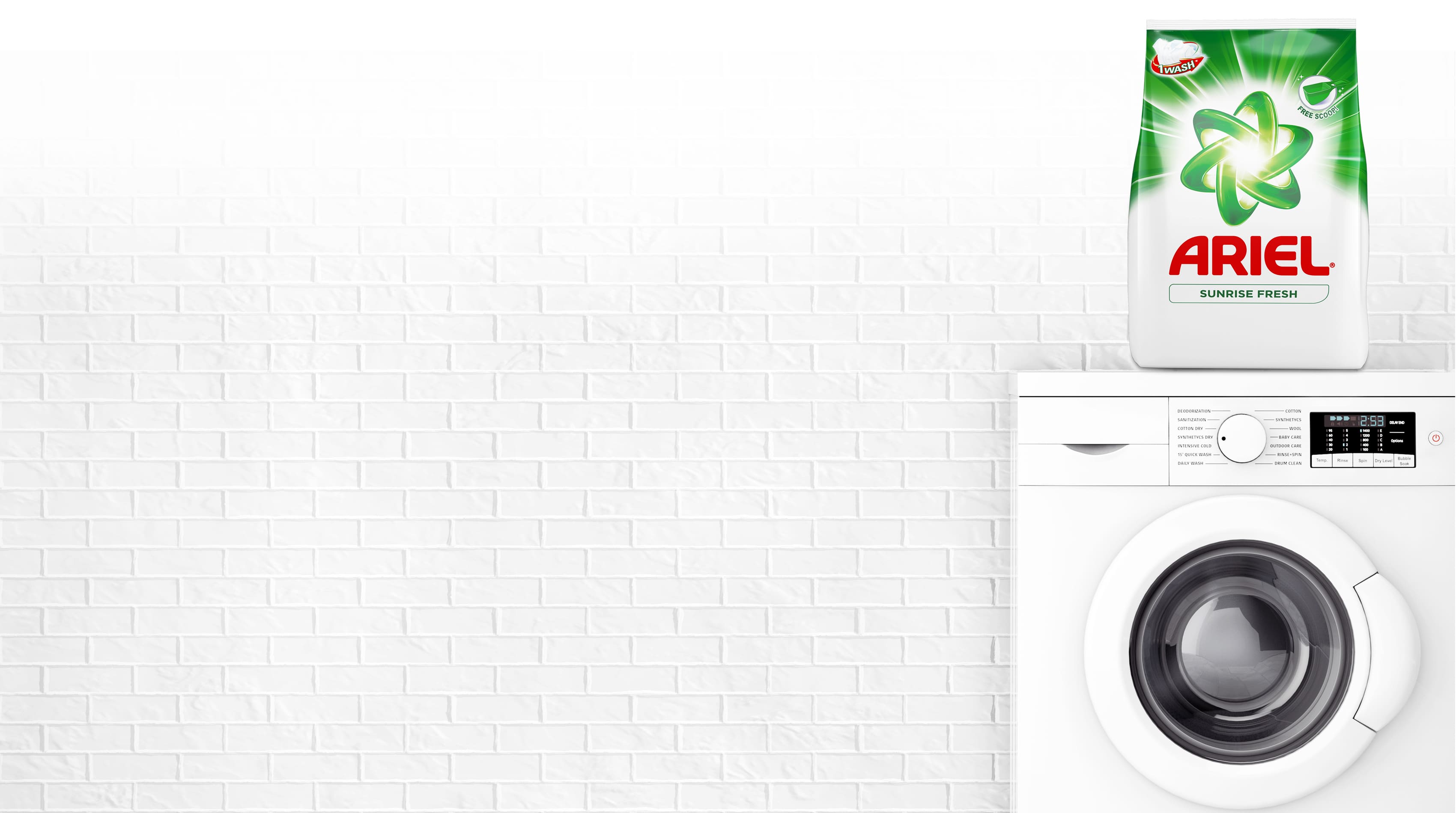
We explored a single colour packaging strategy for simplicity and shelf blocking. To convey Ariel’s superior cleaning power, P&G defined white as the standard background for all variants, strategically positioning Ariel as an accessible premium brand. White became the signature colour that distinguished Ariel from its competitors. The Atomium (logo) was enhanced to position Ariel as a brand driven by innovation.
The challenge of using White as the universal Ariel brand colour was the reality of the retail environment. White shows dirt easily and the General Trade in Asia is far from pristine. In addition, studies showed that critical customer groups missed the previous green packaging that they associated with Ariel.
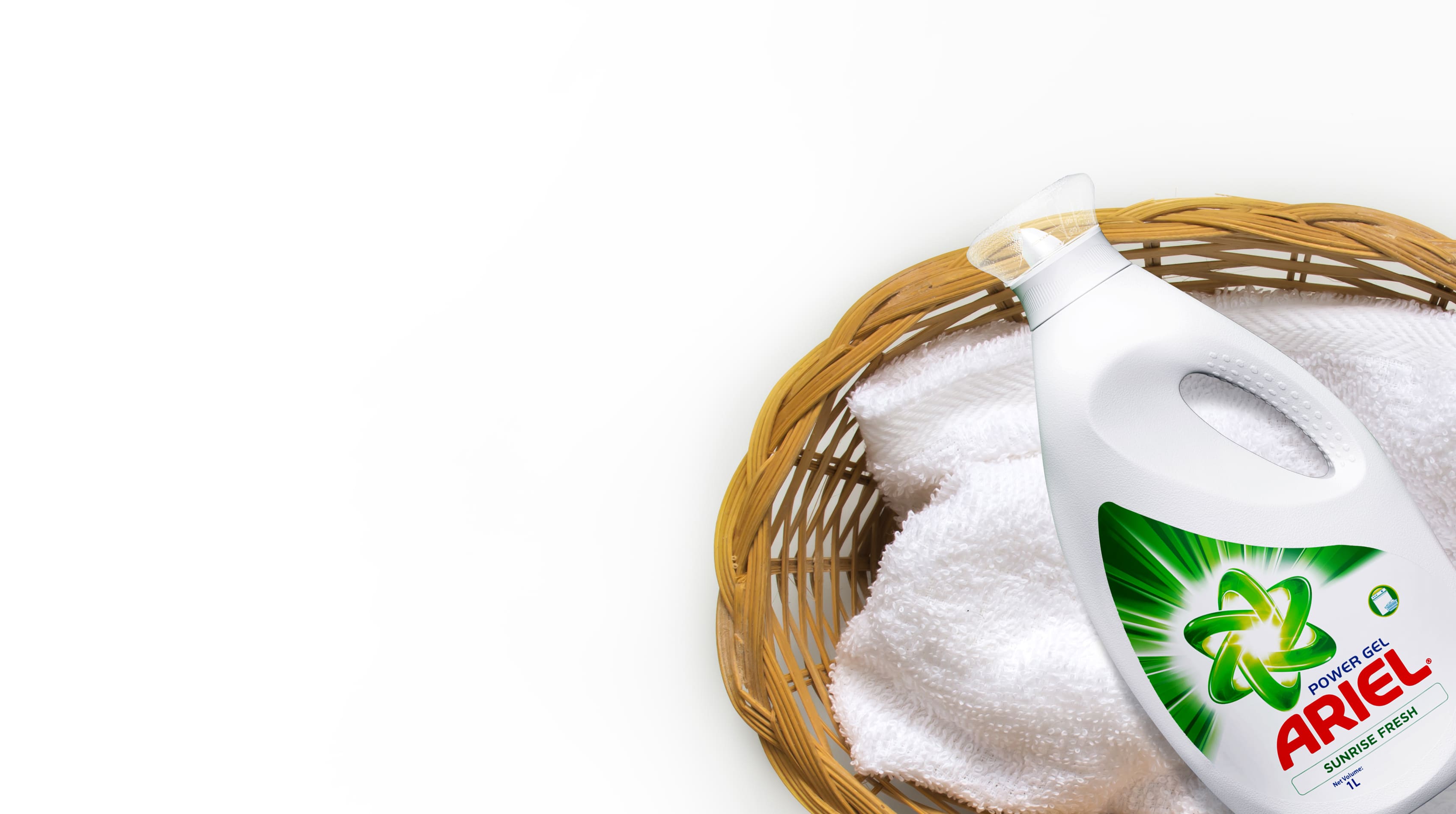
By creating a new fresh Ariel green and using it in combination with white we were able to ‘protect’ the packaging from the worst grime of the retail stores and to build a powerful and distinct green and white brand-block that felt fresh and looked clean. Green & White Ariel took off, winning over consumers in-store with its powerful brand blocking and relevant message of innovation.