CLIENT
Nestlé Milk
PROJECT
Making a Splash in the Malaysian Milk Market
DISCIPLINE
Insight, Research & Analytics, Competitor Analysis, Design Planning & Strategy, Packaging Design, Packaging Implementation
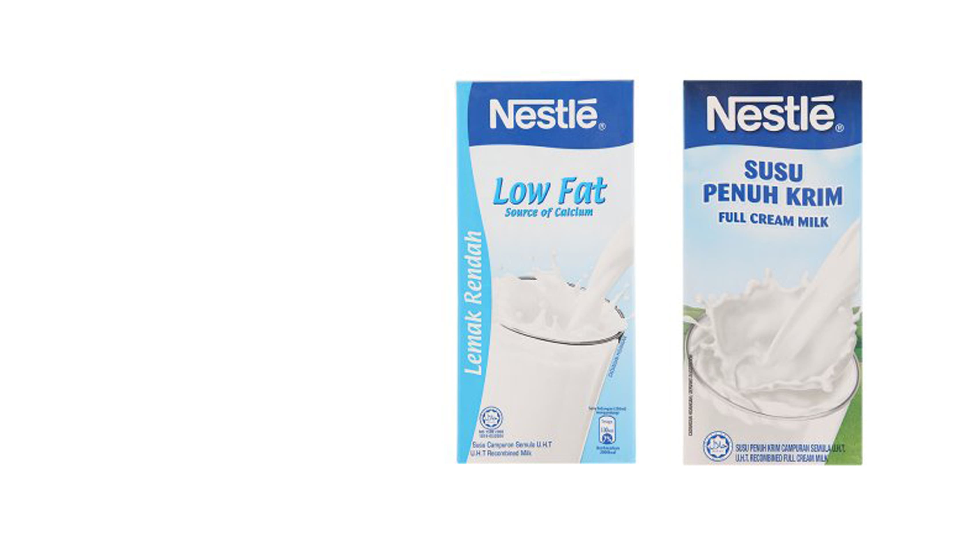
There are few FMCG categories as competitive and commoditised as milk and Nestle faced a particular challenge in Malaysia with its regular UHT brand. With low single-digit market share, Nestle UHT milk was battling multiple local and international brands on price using the Nestle name.
Despite its strong product quality, Nestle UHT suffered from poor shelf standout and a lack of appeal to modern mums with its undifferentiated product. Our task was to find a way, using packaging alone, to deliver a distinct story that would make Nestle UHT stand out from the herd.
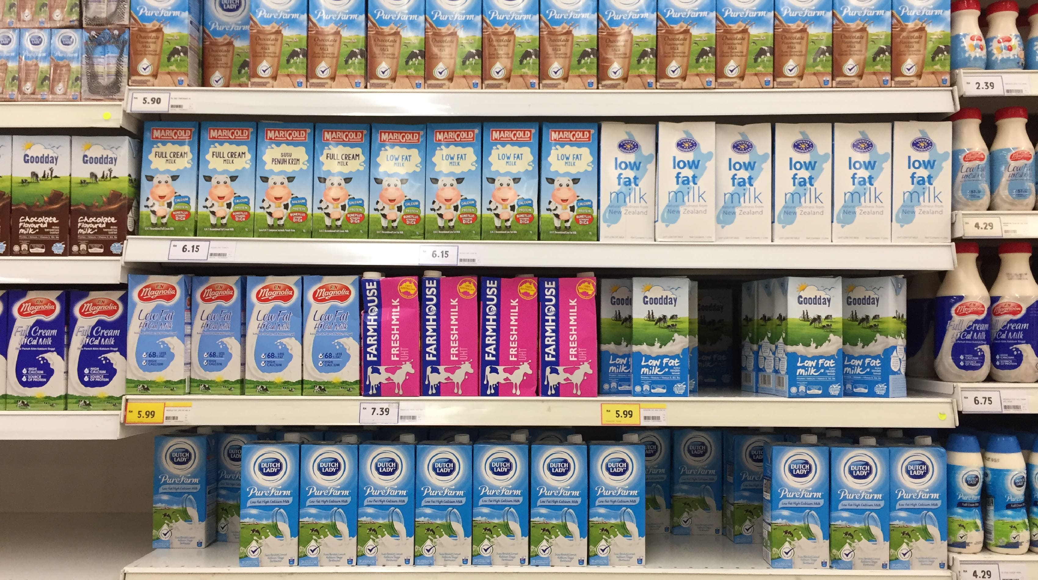
In a category characterised by ‘milk splash and meadows’ imagery, Nestle required a packaging solution that would grab attention in a different way.
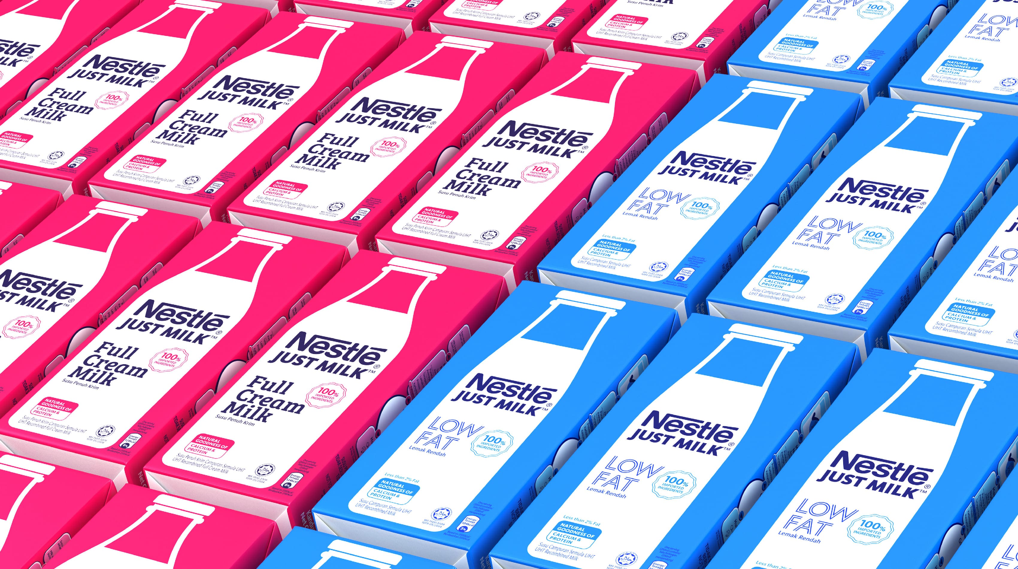
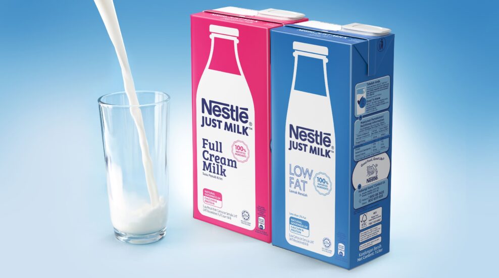
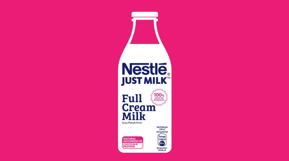
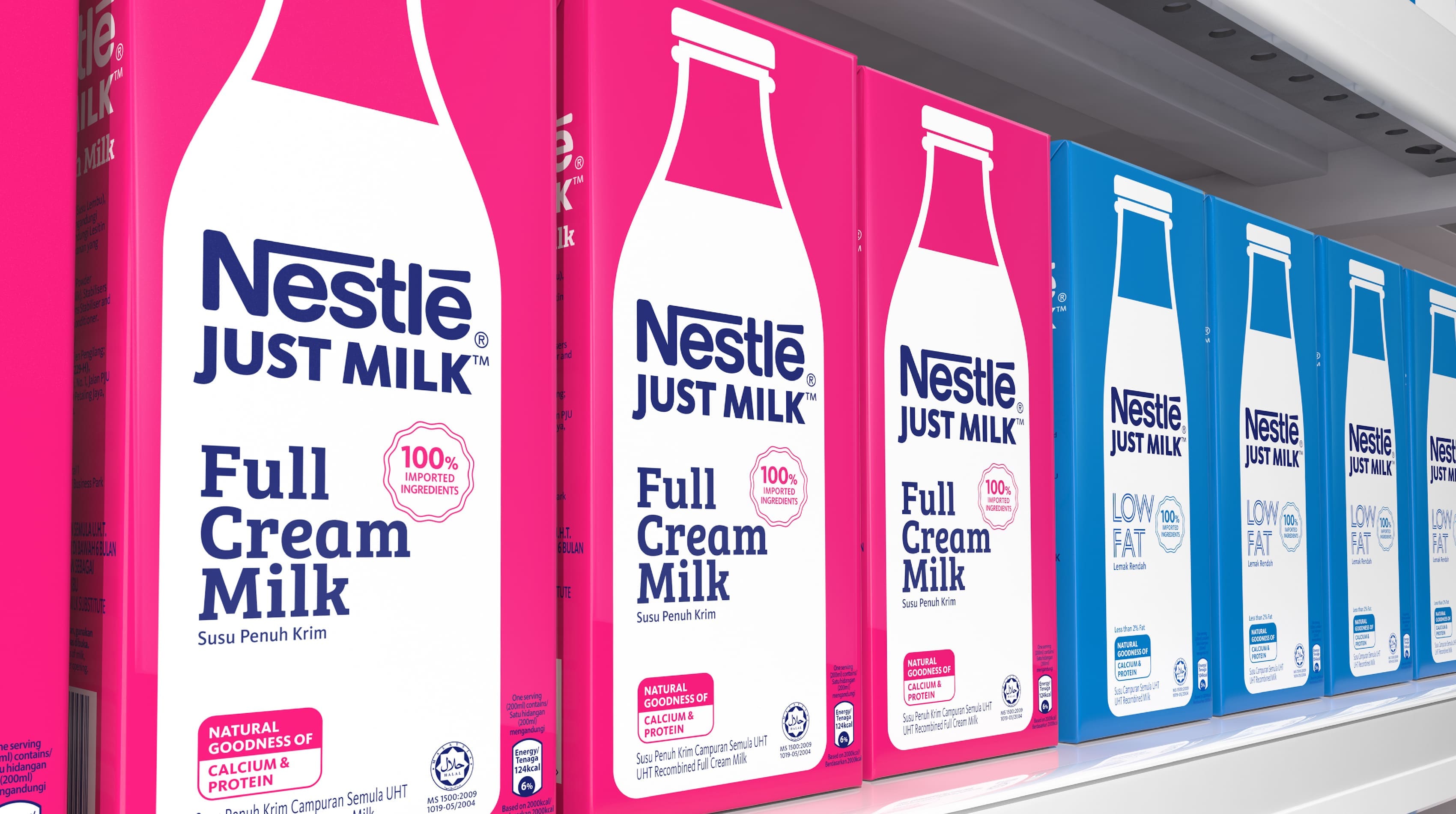
We decided to create a virtue out of simplicity. This was milk; pure nutrition with nothing added, nothing taken away. The solution was to focus on a ‘Just Milk’ proposition, and our inspiration came from the humble milk bottle – an enduring symbol of honesty, freshness and wholesome nutrition.
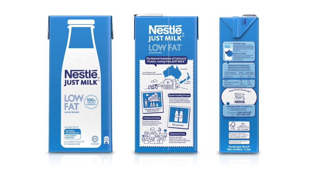
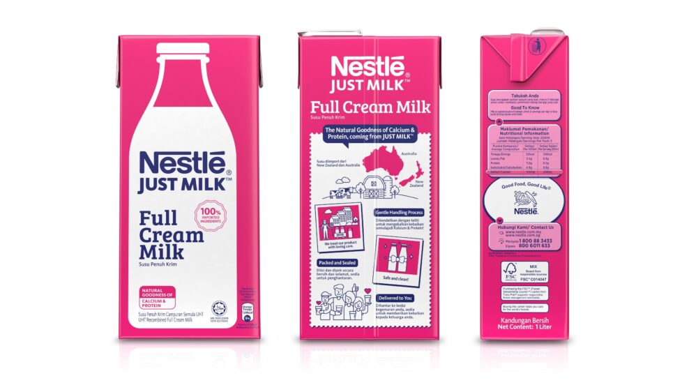
The graphic milk bottle become the iconic feature that carried all the brand and product information. Magenta and brilliant blue colours were used to distinguish Full Cream and Low Fat variants. Single colour typography reinforced the principle that this was a value brand, pure and simple.

In contrast to category norms where every competitive brand shares common imagery, our approach created immediate impact and recognition with powerful shelf-blocking.
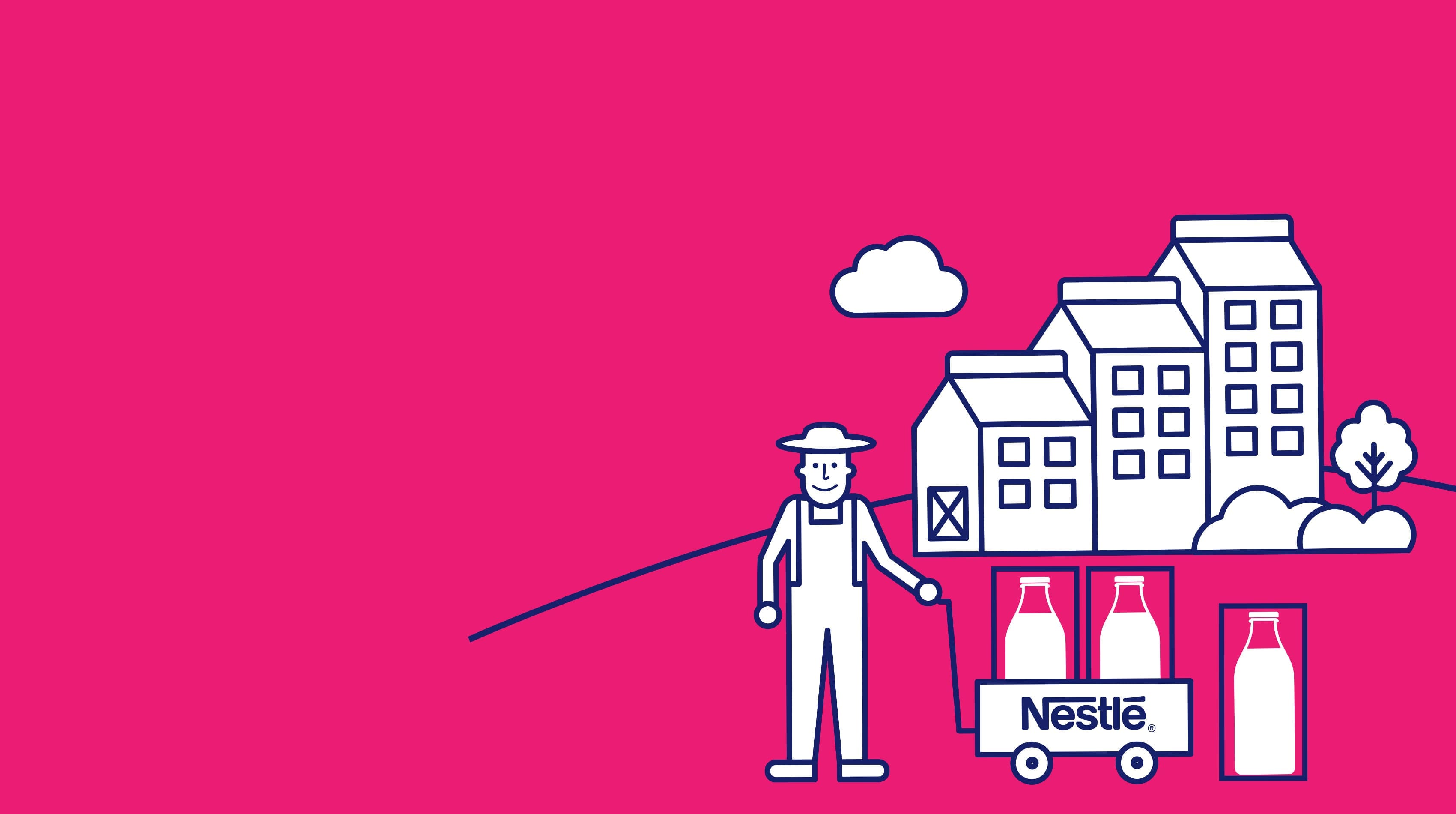
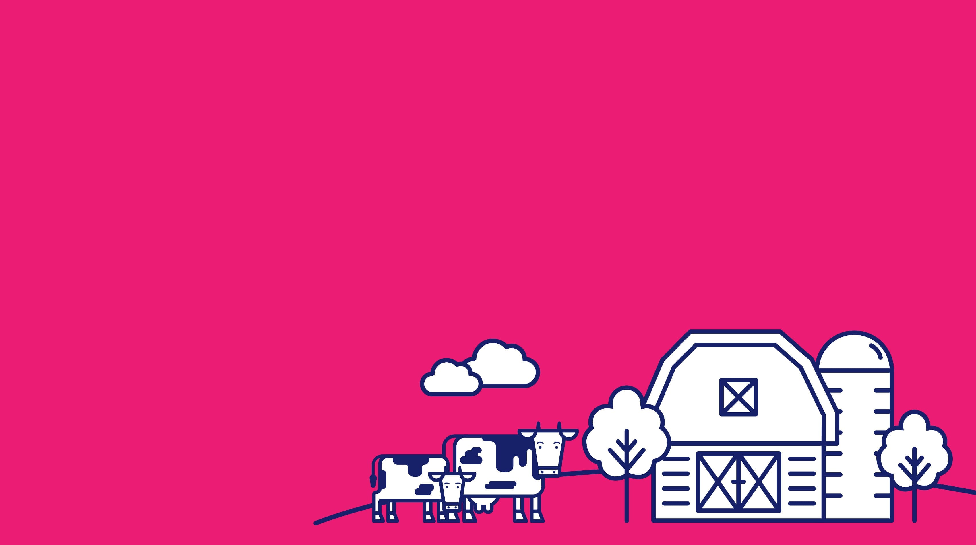
To tell the ‘farm to table’ story on back-of-pack we developed a set of charming illustrations showing the journey of the milk through the supply process, thereby reinforcing Nestle’s goodness credentials.
Our fresh take on a cliché-ridden category delivered immediate results, with sales doubling in the month following the relaunch and market share increasing 4 fold within 6 months – with no ATL support. Customers took to social media to celebrate the brand, flooding Instagram with images of Just Milk packaging in many unexpected places. When asked what created such enthusiasm, they pointed to the packaging, “It’s so unusual, just so cool”.
Initially launched in 1-liter formats, the designs were soon extended to 200ml single-serve packs to meet a wider variety of consumption occasions, from canteens to school lunch boxes.